Mindful Wellness - Branding


BRAND DEVELOPMENT:
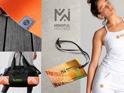
Our goal for her logo was to convey the essence of vitality, energy-shift, connection, a genuine professional tone and style that increases the awareness and credibility of Mindful wellness offerings.
The logo was designed with the above in mind.
We wanted to capture Kristin energetic nature and passion. She needed to look corporate/scientific and friendly “yoga” approachable. She knew she wanted a type symbol, human figure and the color orange.
WE ACCOMPLISHED BY:
We first started with a brand questionnaire then created a mood board to make sure we were all on the same page with communication and direction.
I started playing and working with shapes to create balanced tension between M for Mindful and W for Wellness.
I wanted the to create a yin and yang of dualism, showing how seemingly opposite or contrary forces may actually be complementary, interconnected, and interdependent, and how they may give rise to each other as they interrelate to one another.
The positive and negative balance between M-W: mirrored opposite give the feeling of being interconnected but yet interdependent on the whole.
I brought in the three circle elements into the design to represent the balance of the three areas she bases her program on: Think, Eat, Move - the three circles help to maintain the interconnection to the MW body - I did this to show balance/tension of these three different areas carefully interplaying to make a whole.
I chose a simplistic calm type face to complement the icon and promote the simplistic corporate feel.
I chose the colors for each area to complement the energy of the orange and match the areas of her three step program:
orange (think - empowerment),
eat (green-fresh-clean),
move (yellow- energy movement)
We then shortened her sayings to THINK - EAT - MOVE and added the three colored dots before the word (...Be) to her tag line. This helps the viewer understand that you need all three areas of her program working together to become your best.
The icon used in each area of the program helps to visually promote the three different parts of the program to better engage and educate her clientele.
Powerful images and color give her a vitality energetic feel with the genuine simplicity of the icon creates a perfect blend for her professional corporate brand.
The new brand identity created better servers how her customers and prospective customers to perceive Mindful wellness’s brands services.