Onewho Logoscape

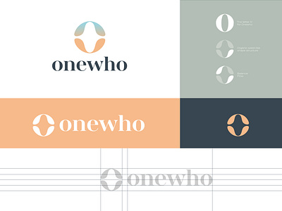
Logo: As a letterform, the logo is an “O” for Onewho. As a shape, the logo is 2 symmetrical plant-like shapes coming together in a circular formation. This solution provides the brand a mark that clearly represents the name of the company, while touching on Onewho’s mission to bring people a happier, healthier, and more connected life.
Color: The color palette features variety. Colorful brands allow for growth and flexibility when creating future omnichannel content. Mother nature paints some incredible color gradients across the sky above our heads. Keeping to the influence of the natural world on the company and the logo mark, various skyscapes served as inspiration for the color pallete. The main gradient, composed of orange and blue, further touches on the aspect of balance. It, along with the supplemental colors and gradients, are calming especially when used in combination.