Petlivery - Branding

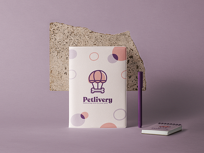
Recognisable and cute, easy to understand and an eye catcher, that’s the Petlivery isologotype.
The core function of the app and the core concepts of the brand all mixed in one image.
The “i” circle gives it an organic and sweet look and relates the isotype with the logotype.