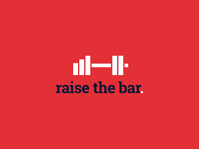
Raise the Bar

1 Hour Logo Challenge #6 Raise the Bar
I have to admit, I was a bit too obsessed with challenging myself to connect the dots between two things and bringing them together. In this case, it was a logo for a gym named "Raise the Bar." As soon as I realised how I could put a barbell for the gym together with a bar graph for the name, I couldn’t resist. It was at the expense of the logo’s appropriateness though 😅
Hitesh made out a point that immediately hit me: it didn’t look like a logo for a gym. It needs a more masculine/rugged feel for it to fit the industry. The typeface could definitely use some improvement too. An all caps would perhaps work better for a gym, instead of the current corporate feel.
Do I need to go and hit the gym more? 😂
Nevertheless, I still had fun working on this and learning a valuable lesson from this makes the mistake worth made, I guess 🤓💪