Sage Cord Co. — Branding and Package Design

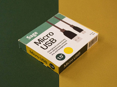
This package design project was intended as a conceptual solution to electronic-cord-shopping-induced confusion in a retail setting. The goal for this particular piece was to be a sample package within the design system of a fictional brand: Sage Cord Company. This brand specializes in electronic cords and cables, and they are loosely marketed towards senior citizens. The vast array of cords required for a connected life these days can get quite overwhelming, and this package design aims to eliminate user confusion over which cord is right for their device, saving them time and hassle. Designed to be readable and quickly communicative, the box features large text and simple, representative illustrations, detailed only to the point of differentiation. The brand name “Sage” comes from the idea of sage wisdom, which is both a tongue-in-cheek—yet respectful—reference to the intended audience, and an experience of wise purchasing which the brand aims to deliver to said audience. The brand colors are the shades of green seen on the package, but the secondary colors are variable depending on the product; in this case, golden yellow for a Micro USB cord.
The photography style displayed here is representative of what Sage’s style would be across all their media platforms. The warm temperature and soft grain texture are not visual techniques typically used by the electronics industry, but this unique visual personality serves the twofold function of giving Sage a very distinctive brand voice among competitors like Insignia or Nomad, and also associating a pleasant and familiar feeling with the brand and its products.
Each package will have a pull-out paper or plastic tab in the exact shape and size of the cord end itself, so that buyers will be able to pull out the tab, insert it into their device, and test whether or not the cord will work for them without taking the it out of the box.