Hotel Londra | Logo restyling

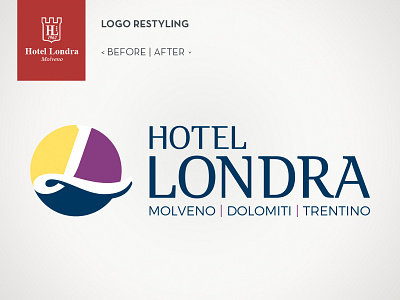
The aim of the restyling was to modernize the logo, making it more dynamic and with more vibrant colors, which conveyed concepts such as sport, physical activity and relaxation.
The choice was to use the letter "L" as if it were a boat sailing through the wavy surface of the lake, adding some colors that supported the client's choices and targets.