


Thought On iOS 7

A lot of fuss has been made by the creative community about Apple's new iOS 7 design. It is easy to scoff at the new icon corner radius. The extravagant use of gradients and the seeming lack of a subtle aesthetic touch that we are used to seeing. In truth there are many things that the design lacks, but the general public is not going to care. A lot like Snapchat's design, it might not be top notch, but iOS 7 is fun to use.
I have been testing out the beta version of iOS 7 and aside from some questionable design decisions I have become impressed with what Apple has rolled out. The animated transitions take from the best of Windows 8. The live wallpapers Apple lifted from Android are absolutely stunning when combined with the classic Apple wallpaper photos we have been accustomed to seeing. Taking the photos and pairing them up with a parallax home screen will go a long way in wowing users. Another Android feature Apple has implemented nicely allows you to quickly scroll through your open apps and close open apps.
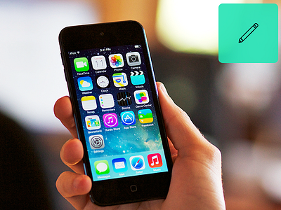
When I first looked at the home screen on an actual phone I was struck by how good the simple, brightly designed icons feel. I've seen a lot of great icons designed and posted on Dribbble this week. In my mind most of them are slightly better than Apple's but people who are not designers won't notice the difference. Ask yourself, who are you designing for? Apple seems to know their audience and it's not us.