


Stromic Visual ID

The challenge
-
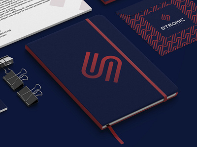
Stromic is a personal brand, which should convey the essence of the programmer, technology and bring recognition to his work. The symbol was worked in a strong and geometric way, which causes an impact and a feeling of modernity. The shape of the letter S was worked in a "obvious" way, the concept of cables not so much.
Stromic is a daring, young developer, willing to bring plausible solutions to companies and situations. Its positioning is strong, and the brand should accompany it and transmit all of this to the market.