Neumorphism Banking App

Hi, Uxers! 👋🏼 ⠀
⠀
🧐As designers, we try to keep ourselves updated with the latest topics, tools, and design trends, though, sometimes we rush to try to find our fit on a sea of trendy designs out there, without actually being an auto critic of them. ⠀
⠀
🤔During the weekend, I researched Neumorphisim, also knowns as soft UI. This trend has gained a lot of popularity due to its design simplicity and minimalistic look. It uses one color code and combines light and dark drop shadows to get the contrast between elements, however, does it offers a good user experience? Let's find out.⠀
⠀
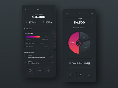
🤓I made a dark Neumorphism Banking App design following this trend acceptance criteria:⠀
One Color for all elements in the design, except the color contrast (Credit card & Graph).⠀
Dark and light drop shadows.⠀
⠀
🤩The result was a minimalistic and nice-looking interface. During the design process, I started to question myself about the UX of this app, and how likely a typical user will interact with it. After a couple of minutes, I identified a specific pain point, accessibility.😔⠀
⠀
✅ On most of the regular apps, we use existing design systems that people are used to, however, in Neumorphism, there are no solid design system foundations. The soft contrast makes harder to identify between elements and buttons, making the UX terrible for those who are not familiar with this trend. ⠀
⠀
👌🏼I have come to the conclusion that most of the time we pursue design aesthetics, and it is not bad, however, we need to create accessible, usable and achievable experiences. ⠀
⠀
✌🏼What do you think about this trend?