


Butterfly Winks | Makeup By Francis C Combination Mark

The primary goal for this branding identity re-design is to merge 2 brands “Butterfly Winks” and “Makeup By Francis C” into one cohesive, and memorable logo system that can be easily identifiable and desirable to new and returning clients.
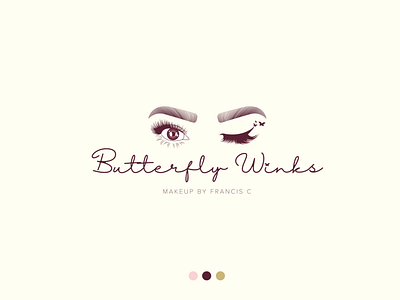
The “Alluring Flutter” logo family was carefully crafted using illustrations of Francis herself, paired with elegant typefaces to achieve the ultimate cosmetic identity that would stand out, get people talking and work beautifully for a new line of lash products.
It just so happens to incorporate nineteen bottom lashes on the left eye to give it an extra special symbolic meaning.
Most logo mark designs that I create are on the more simple side because it creates an easier process of going live and reproducing the mark in multiple applications.
In this case, the client was looking to expand in their marketplace and begin selling lashes as well as doing makeup. They were looking for a wordmark that could be consistent across their makeup business and on a product line in the near future.
This mark has a more complex look and has a greater amount of design elements to it that can be used interchangeably on a variation of colors in the palette.
The Butterfly icon is present and consistent in the primary logo and as an individual wordmark.
This butterfly icon was created using the golden ratio to give it natural and symmetric feelings that are associated with butterflies.