UI kit for a clothing store brand- Mirror

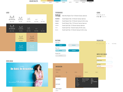


I wanted Mirror to have a fresh, modern and unique look for its entry into the digital world. Hence, I decided to choose a bright color palette. Instead of going for a plain background, I decided to add the blocks of accent colors to accomplish a more colorful vibe.
I feel the “narrow” nature of the fonts Bebas Neue and Oswald got a perfect balance with the choice of the colors.
While designing the logo, I first listed out the adjectives and verbs that could be associated with ‘Mirror’. I liked the idea of representing something of a broken piece of the mirror. Hence, I decided to direct my logo work in that respective direction.