Lotte van den Hout Letterhead

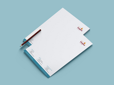

We developed a highly-distinctive and memorable brand identity for Harbour Hospice. This was rolled out over all touchpoints such as the letterhead for Lotte van den Hout and company stationery. The redesigned branding brings a new level of visual impact and engagement to the company communications.
Follow the White Rabbit 🐇
Website | Instagram | Facebook | Behance | Pinterest | YouTube
Like what you see? contact@whiterabbit.nz