Elegance

João, the creator of Elegance, met us through a video of one of our founders talking about the entrepreneurial experience, identified himself and sought us out to help him include a modern and sophisticated brand in the market that aligned the right price to sophistication.
Against this background, the challenge was to strategically understand the connection points between offering a quality product at an affordable price. So the idea was developed through the main concept: from minimum to maximum. The concept seeks to convey the broad approach to pricing and ultimately makes the brand somewhat inclusive and sustainable.
A unisex brand that seeks to be both sophisticated and modern. She is a bit unusual and introvert but extremely empowered, authentic and innovative.
Solution:
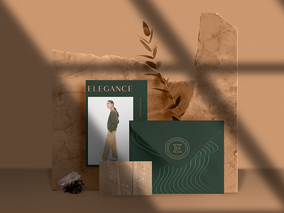
An elegant and memorable brand must have as one of its symbol elements something that represents its royalty. We decided that this element would be a crown and we used the golden ratio to escape the symbol cliché by uniting it with the initial of the mark.
The golden ratio is a form of measurement commonly found in nature. When used to create a symbol, this calculation results in organic and natural compositions that are aesthetically pleasing to the eye because of their exact proportions.
The identity is composed of three variations of fonts being used serif in some applications due to the similarity to the crown symbol. Its chromatic palette is formed by different colors but together they form an innovative visual composition. And, brand abbreviations were also created using the acronym ELGNC for a more versatile brand with several variations.
_
Check out this project and others on Behance.