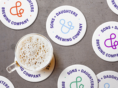
Sons + Daughters Brewing Co. Packaging


The name of the brewing company "Sons + Daughters" was inspired by the historic Sons and Daughters of Liberty in Boston during the American Revolution.
The identity uses a texture that incorporates historical, environmental, and familial meaning.
- Tree rings record its age and climate conditions
- Family tree of revolutionaries
- Boston's protest symbol the "Liberty Stump"
In Boston, there was an ancient elm visible from where the colonist would meet that become a symbol of revolt. Over time, hundreds would gather under the elm in resistance to the British political acts and increased military activity. This elm tree became known as the "Tree of Liberty" by the freedom seeking colonists.
In 1775, the British loyalist and soldiers cut down the tree in retaliation and all that left was a tree stump. The colonist defiantly continued to congregate by the stump and renamed the symbol of rebellion the "Liberty Stump".