Spotify Music Player Redesign

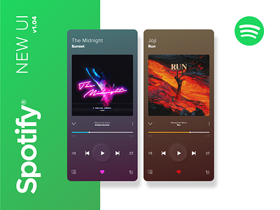
Without swaying too far from the original Spotify player I wanted to bring more emphasis on artist expression. The current player already pulls through a slight gradient from the album artwork colours, but it's quite dull in most cases.
Alongside the gradient, the heart and progress bar could be themed by the artist to compliment the album art, bringing a more personal touch.
The only UX change I made was to bring the overflow 'kebab' menu and the return arrow down from the top. From a familiarity standpoint the top makes sense, but they're very difficult to reach now that smartphone screens are exceeding 6" displays.