Letter 'g' Logo Concept

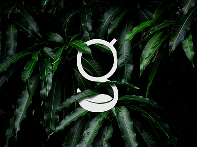
I made this logo concept for a nutrition company that specializes in earth-grown supplements.
But in the end, they have decided to go in a different direction.
So this one is currently on sale. If you are interested hit me at dhananjaya.ddg@gmail.com
The concept is very simple,
The top circle of the letter 'g' represents the earth and the bottom leaf represents nature. overall letter 'g' gives the idea of grown from the earth.
This symbol is a part of a wordmark logo.
I will publish the full logo soon.
See you in next shot. :) #cheers ♥
Available for any branding projects.