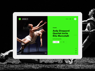
Grand T website
Our proposal for the redesign of the Grand T website, a cultural place located in Nantes. Our response revolved around four main axes:
an assertive tone,
translate the social dimension of the place,
Express the innovative personality of the theater,
Extend the graphic charter on digital.
The tone is asserted: sharp contrasts, solid colors (green, black), typography used in large size, alternation of voids and fulls, wide breaths, generous photos ... The artistic direction is modern and uncompromising, while being sober and elegant.
In response to the social dimension of the place, our reflection is based on the principles of social design, which favors the useful over aesthetics.
The innovative personality of the theater is reflected in the ergonomic and functional choices: the reception slider, the calendar, the menu, the "relationship theater" section, the social wall, etc.
The site is built on a fluid grid. It adapts to all resolutions, offering optimal and modern space occupancy.
The model respects the graphic charter of the Big T - the relationship with the existing communication tools is obvious - and in some cases it enriches it: "theater of the relationship", (eco) T system, the calendar ...

