Xbox logo redesign

Xbox logo redesign
__
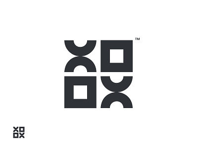
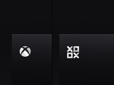
In this exploration, I simplified the Xbox logo with more meaningful shapes of X & box.
Instead of full eliminate the circle of current logo. I simply used that in X shape and Box as a box.
Now logo can be seen by 2 prospectives as xbox.
__
If you like the concept like, comment & share.
_
or if you have any questions feel free to dm me.
Let's Connect
💎 Instagram- Daily design & Logo grids.
✍🏻 Behance- Projects & Case studies.
📌 Medium- Share Experience & design resources.