


Yoga Logo | Proof 1

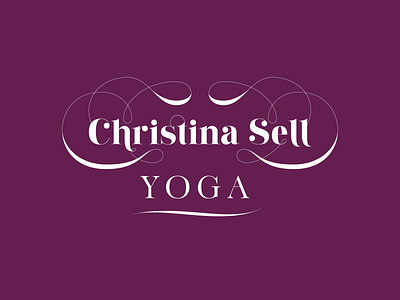
Here's the first proof of the logo I'll be presenting to the client! From the last WIP, I made changes to the swashes and added some thickness.
This logo is for an international yoga teacher who teaches asana as a vehicle for inner work. The logo represents the maturity of the students she attracts, and the depth of her offerings.
And finally here's a quick explanation of the logo, as will be presented to the client:
"There is significance to the swoops and swashes. They connect the logo back into itself and represent the idea of "pulling on the thread" to expand one's understanding of the practice, or to go deeper inwards. Following these literal logo threads one will encounter twists and turns and some variability in their thickness. That too is representative of the rhythms of one's practice and speaks to the meandering path many of us take, all within the greater scope of turning inwards."