Starlook

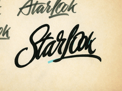
Rejected version of a logo for Russian source about beauty. The client had asked for something calligraphic and lively but in the end it was a lazy font like logo. But I love this version so decided to post it here. Just sketch made with a chisel tipped marker and tuned with a gel pen.