Logo for a small family olive oil company.

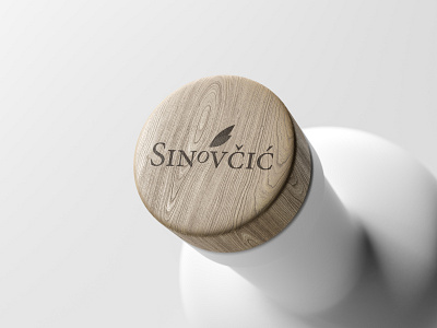
This logo is a project that is still in progress. The business itself is not launched yet, but this logo has been chosen to represent the tradition and modernism in the same time. Simple letter o minimized and rotated so it can represent olive. Two stylized leaves, each in different color to get the depth in the design.