


Dark vs. Light

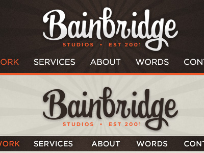
Extending the recent logo concept to play around with some header designs for my site. I really like the look of the logo against the darker brown, but when spanning a full page width, it makes for a really top-heavy feel. So I'm trying out a few different looks...