


Expanding a Color Palette (Lightness)

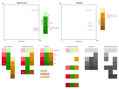
I’ve been attempting to expand the colors in this project’s paltry color palette in order to make thematic status badges. Here are all the ways I could think to organize it to find where the gaps are. I started with the base colors and the following contrast rules.
text:background ≥ 4.5:1
border:white ≥ 3:1
icon:background ≥ 3:1
icon:text ≈ 2:1
(I made a graph for the ruby color, too, but it wouldn’t fit in the screenshot.)