Splice Check Out

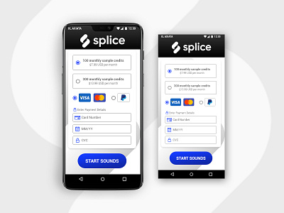
Splice is a sample library for music producer. Their brand color mostly are black and white.
I was wondering if I can make the black and white less boring. So I took their check out page to be redesigned.
First, I found that they like to use a few of blue color on some of their page. So I took it a little further by making it a tertiary color. I also add a little spice to the icons by using the blue color.
Finally, I turn the black and white colors into gradient so it looks more fresh.
That's my idea of #DailyUI today. I hope you enjoy.