Travel App Design Concept


The team is available for new projects! Drop us a line: hello@purrweb.com | WhatsApp | Website
What’s up, guys?
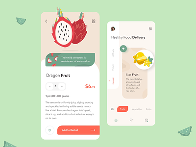
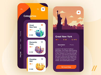
Meet a new design we’ve completed recently! This is a mobile app for discovering the best travel spots. If you want to improve customer loyalty for your travel business (or you’re a sucker for cool designs), check this out!
🏄 The goal we set in the first place was to achieve clarity and create a frustration-free design. To make the CTA button easy-to-notice, we picked orange - with good contrast, it stands out among the other elements on the screen.
🌎 Purple symbolizes independence, ambition, and excitement. To bring these vibes to UI, we used purple as a dominant color while others were used to enrich the scheme.
Don’t be shy! Press L if you like it and
Share your thoughts below!
Created by Julia Tikhiy-Tishchenko
We share experience in designing interfaces for healthcare startups 🏥, give insights into developing an app for pet owners 🐈, and reveal the secrets of coming up with a competitor to famous services 🤩
Keep in touch and check out our recent news 💜
Join us on:
Website | Instagram | Medium | Behance | Facebook