

About this Service
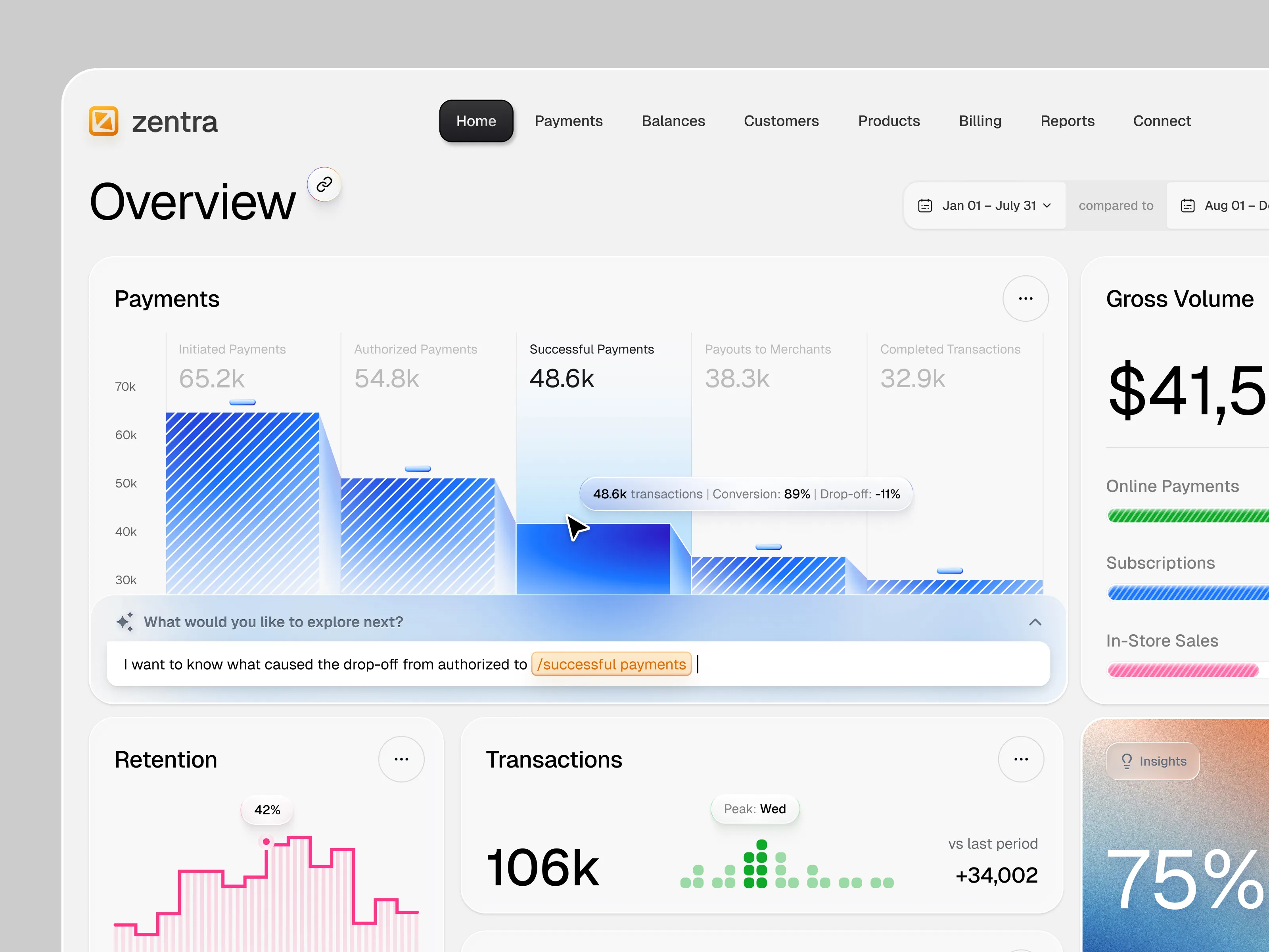
Bring consistency and speed to growing digital products with a scalable UI design system, component library, typography, color system, spacing rules, and reusable patterns built for real product teams.
Build Once. Scale Everywhere.
📦 What’s Included:
Design system audit
Color & typography system
UI components
Buttons, forms & inputs
Navigation components
Cards, tables & modals
Responsive components
Component states
Figma component library
Usage guidelines
📋 Process: Audit → Foundation → Component Architecture → Component Design → States & Variants → Documentation → Handoff
💬 Communication: Daily messages, shared Figma workspace, weekly call & Zoho walkthroughs