About this Service
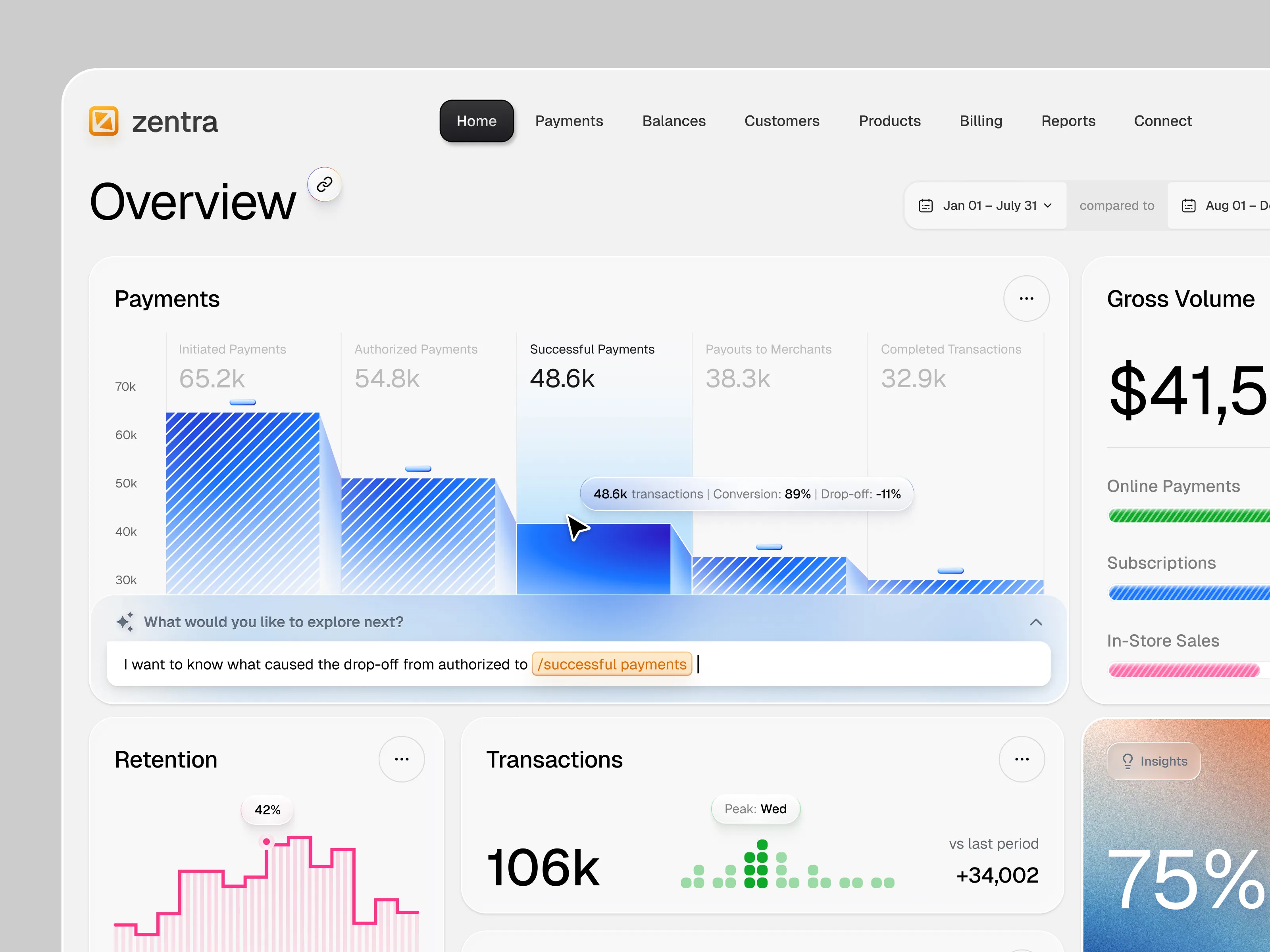
Interfaces built around data people have to act on: reporting, monitoring, telemetry, operations. Charts are the easy part. The work is deciding what the person needs to see first, what they can ignore, and what has to interrupt them.
You receive:
• 12 to 15 screens covering the reporting and monitoring surface, light and dark
• A chart system: which visual for which question, with rules for scale, colour and empty data
• Data tables with sorting, filtering, grouping, segmentation and export
• Alert, threshold and anomaly patterns where the product needs them
• Agreed critical states for the in-scope workflows: no data yet, partial data, stale data, permission-limited
• Component library and Figma prototype for handover
Tools: Figma, variables and modes.
Week 1 audits the questions the interface has to answer. Week 2 structure and one reference screen. Weeks 3 and 4 the remaining surface. Week 5 agreed states, documentation and handover. Three rounds of refinement.
Background: product design for a sports analytics platform, plus dense operational interfaces in legal tech and coaching products.
Screen count refers to unique layouts. Themes, states, and role-based variations are defined separately in the agreed scope.