


About this Service
I Design Clean, Insightful Dashboards That Make Data Easy to Understand
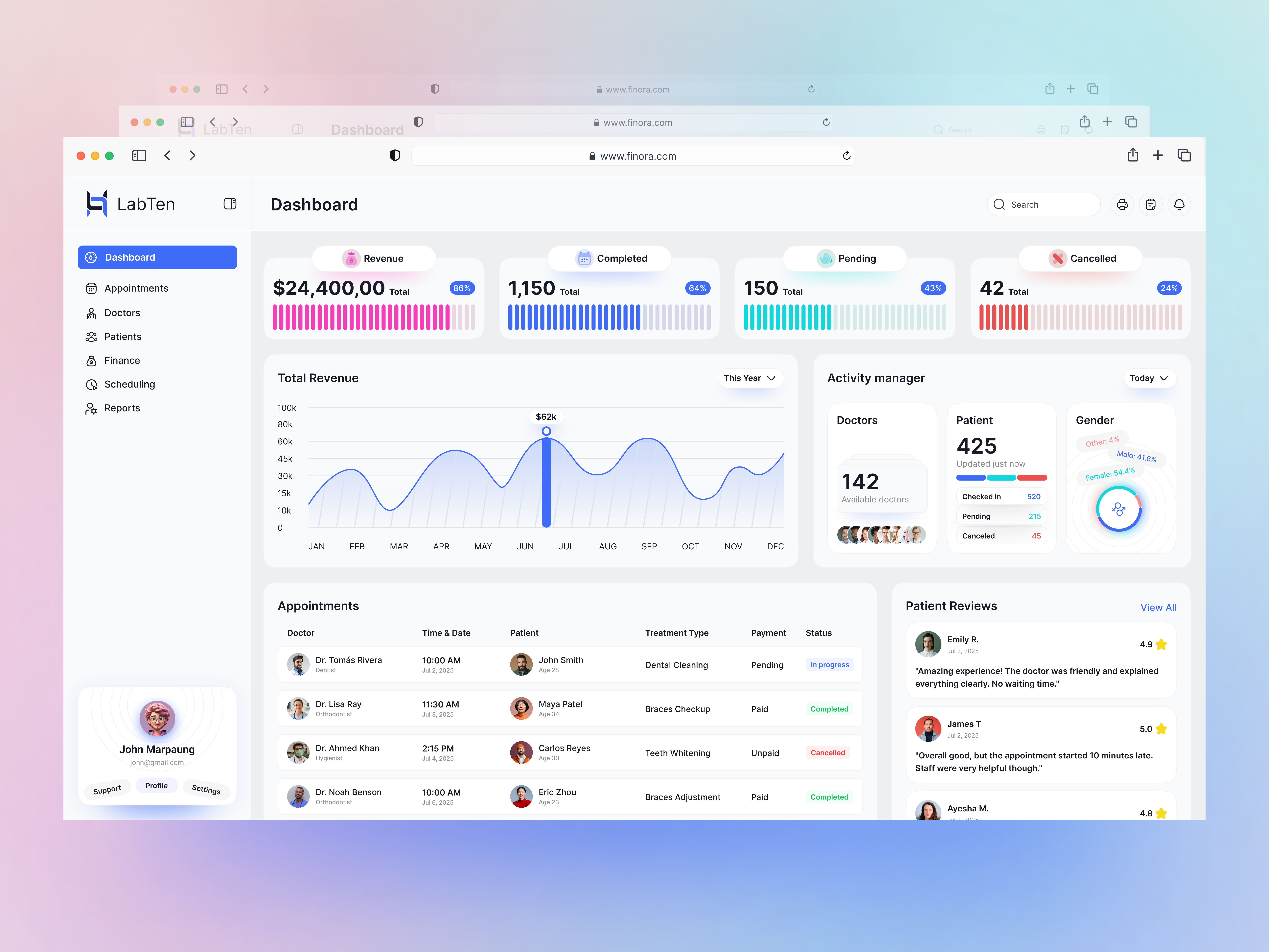
I specialize in crafting dashboards that are both functional and visually clear. Whether it’s for SaaS analytics, admin panels, CRMs, or financial tools — I transform complex data into a clean, intuitive interface your users will actually enjoy using.
No clutter. No confusion. Just streamlined design that helps people focus on what matters and get things done.
What’s Included
UX Strategy for Complex Data – Clear information hierarchy, smart grouping, and intuitive layouts that reduce cognitive load.
Custom Dashboard UI – Minimal, modern, and user-focused visuals designed to match your brand identity.
Data Visualization – Charts, graphs, and metrics designed for clarity, accuracy, and usability.
Responsive & Scalable – Designed desktop-first, but optimized for tablets and mobile where needed.
Design System (Optional) – Reusable components and style guides for a consistent, scalable product.
Tools I Use
Design & Prototyping: Figma, IllustratorCommunication: Email, Zoom, Google Meet (or your preferred platform)
My Process
Discovery Call (30 min) – Understand your brand, users, and dashboard objectives.
Wireframing + UX Flow – Structure the layout, define priorities, and ensure intuitive navigation.
High-Fidelity UI Design – Pixel-perfect visuals that bring clarity to complex data.
Revisions & Handoff – Quick iterations based on your feedback, with final files ready for development.
Why Work With Me?
Strategy-driven design, not guesswork
Interfaces that increase usability, retention, and user satisfaction
Clear communication and on-time delivery
Trusted by 40+ clients worldwide
100% satisfied
Complex Data? Let’s Design It Simply.
I’ll handle the UX so your users can handle the insights.DM me or connect via Dribbble to get started.


