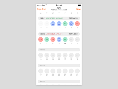
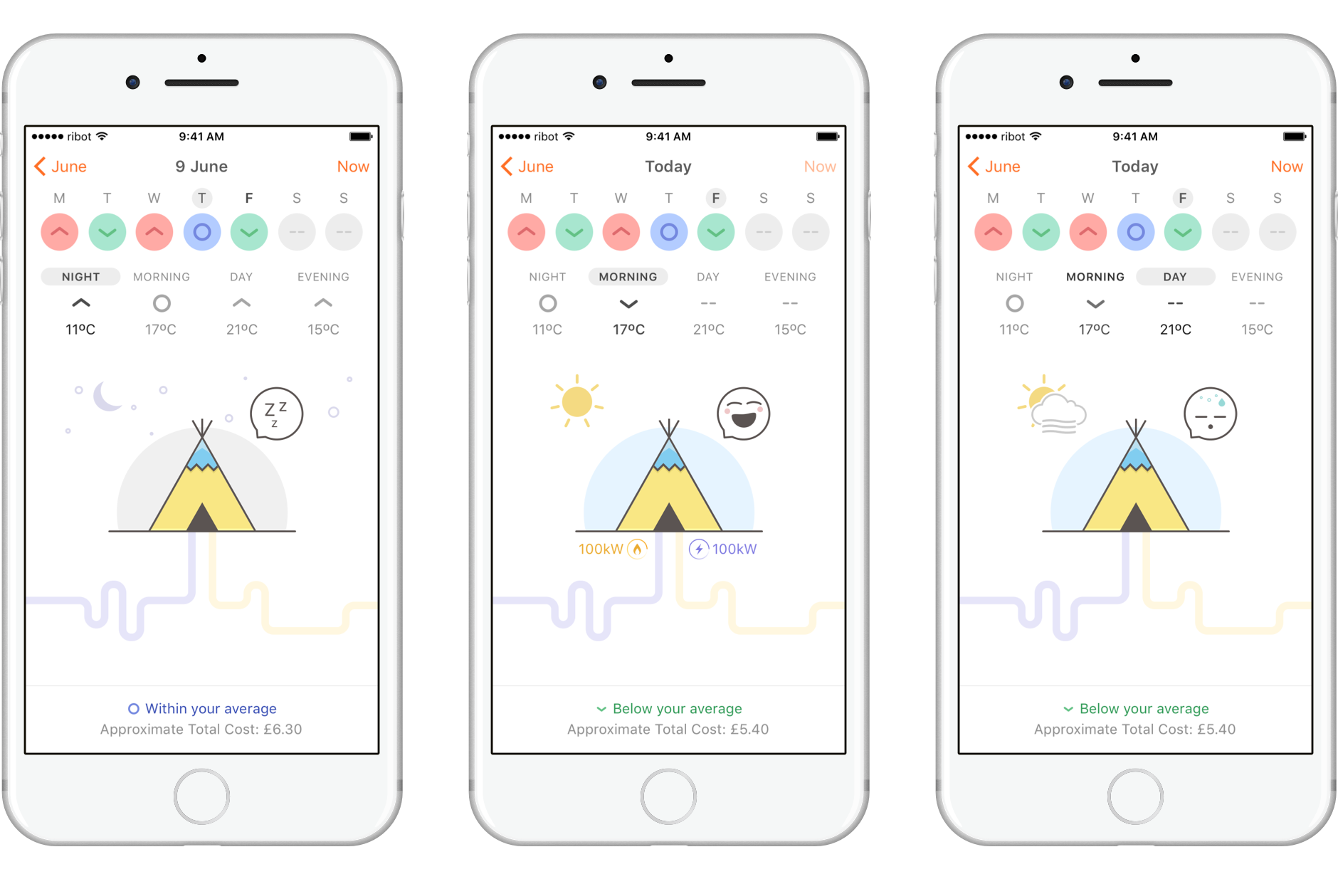
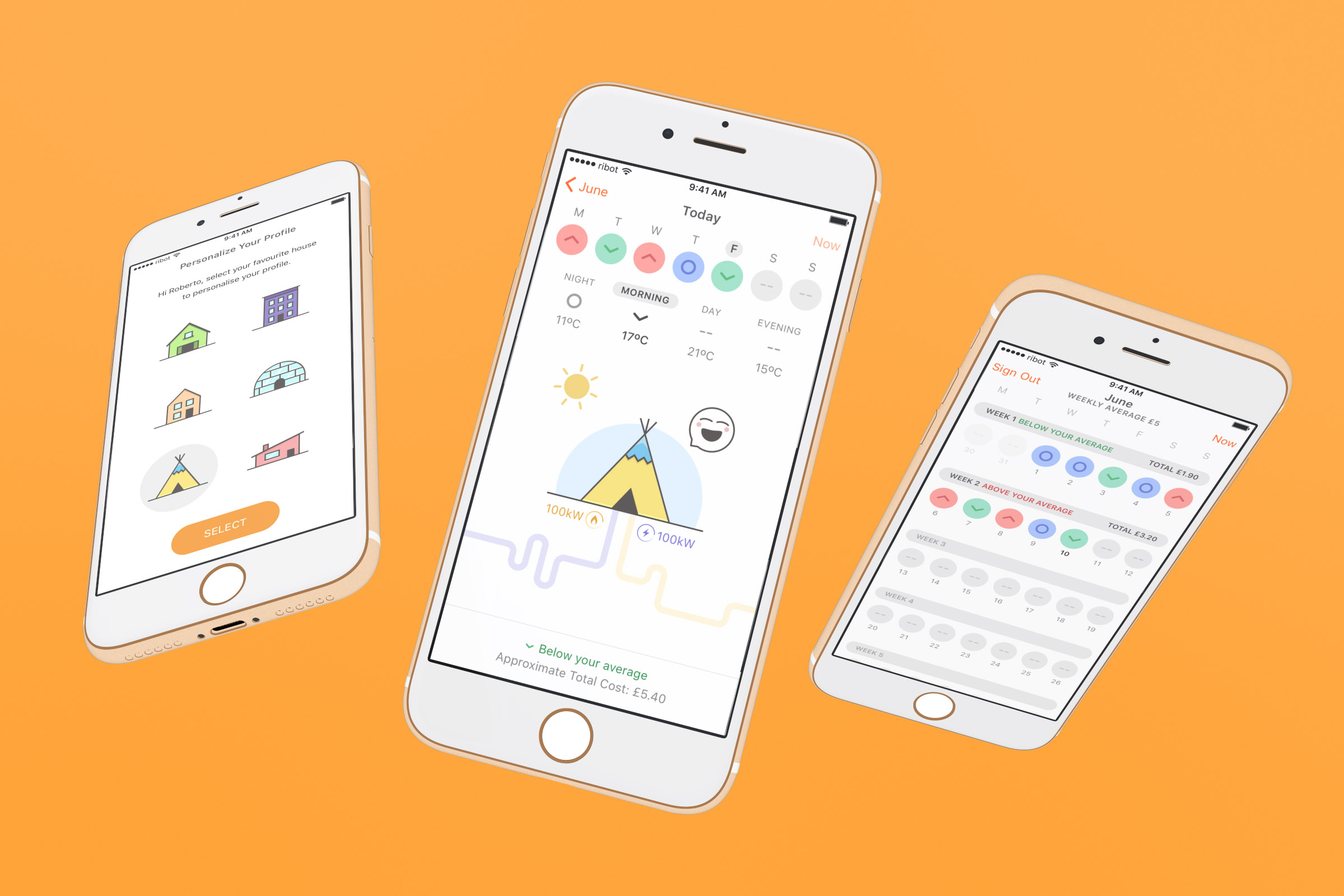
The month view, displaying weekly and daily energy consumption benchmark (above/equal/below average), weekly total and average cost. Benchmark status is color and shape coded in order to ensure an accessible design for color-blind users....
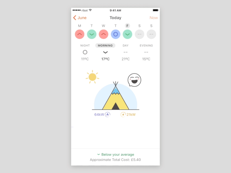
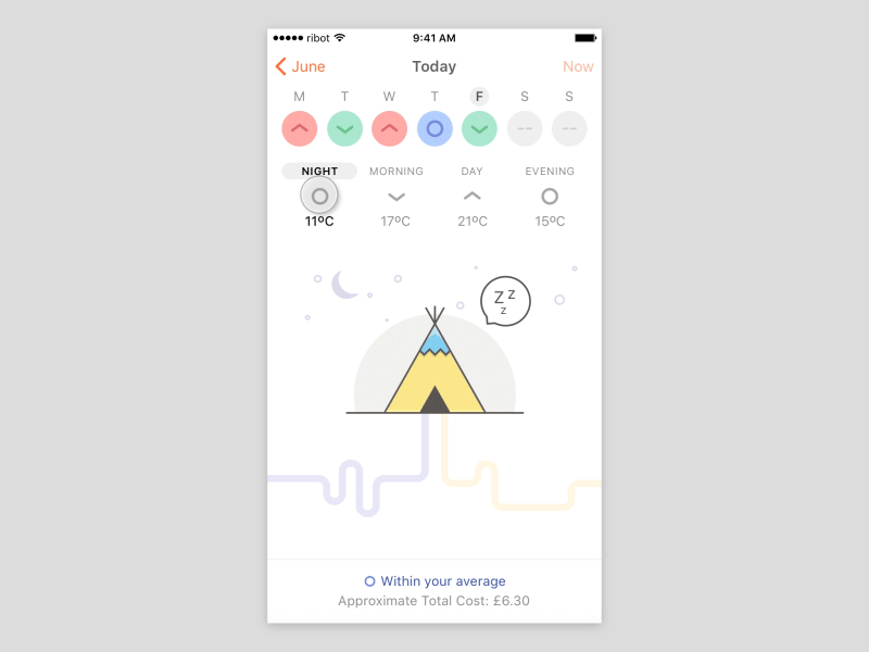
The today view, displaying the current energy consumption in the Morning segment as below average, with an outside temperature of 17ºC. The tepee is chosen by the user to represent their home. Benchmark status is color and shape coded in...
For the prototype, we used smiley and sad faces, which changed if you had above or below average energy consumption. The use of colour on each day, helps customers to track how well their energy consumption is going over the week. We use...
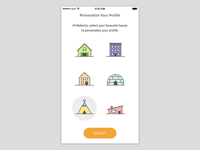
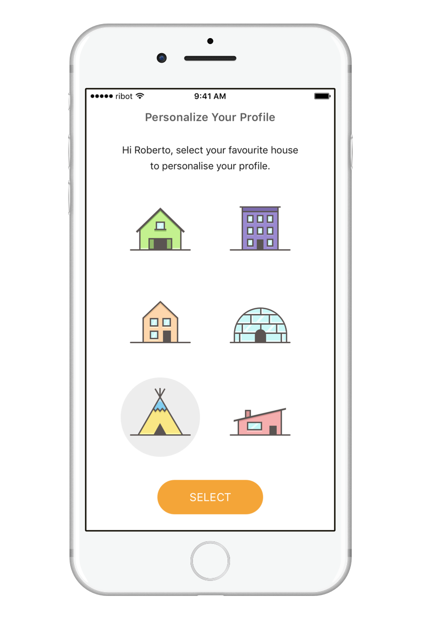
Customers respond well to small, unexpected, playful pleasures. We allowed customers to personalise their home choice in the prototype with a library of different iconographic houses.
👉 Read our case study
We worked together with the EDF Energy Blue Lab innovation team to design a concept that would offer customers a simple way to understand their energy usage over time.
Designed by team ribot: @lmjabreu @benbreckler
👉 Read our case study