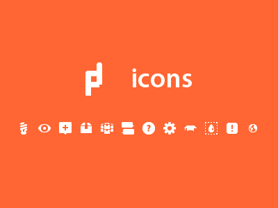
The main and mini logos.
I'm still not happy with the main logo. Some letters are kinda weird to me, specially the E letter.
What do you think? Any advice?
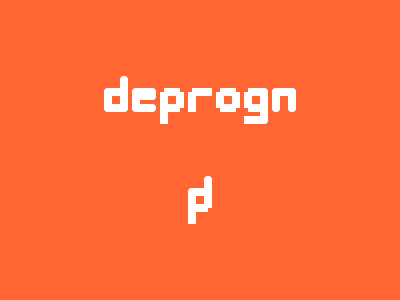
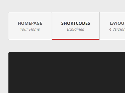
A WordPress theme I'm working on, to be part of a future project.
The codename is Wine, but probably the final name will be something without any connection to the wine. I just called Wine because the red tone I'm using in it.