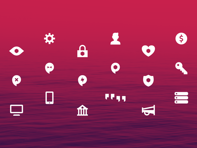
Some primary level iconography for Intercom’s global product platform. These are about a year old or so but I like them.
They may also phase out soon enough so I thought I’d post them.
Solidifying a brand language with iconography, color, and subtle photographic styling.
View the whole case study here → www.twinforrest.com/work/confiant
Yesterday we published a new case study. Enter Trace.
Trace is a collaborative educational platform provided by SCAD. Twin Forrest partnered on strategy, naming, identity, collateral, and the full online experience.
(Thanks to @Matthew...
I put together a collection of hand emojis that live in a greater context of a site launching very soooon. Even made a few into Slack emojis. 👍
View the whole case study: http://twinforrest.com/work/trace
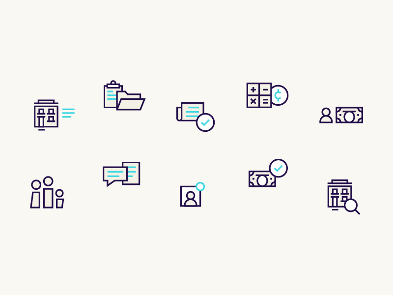
Pushing through a How It Works page. Icons are helping illustrate the style function of the page. Stoked to release more of this brand in the coming weeks.