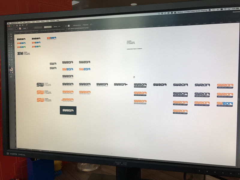
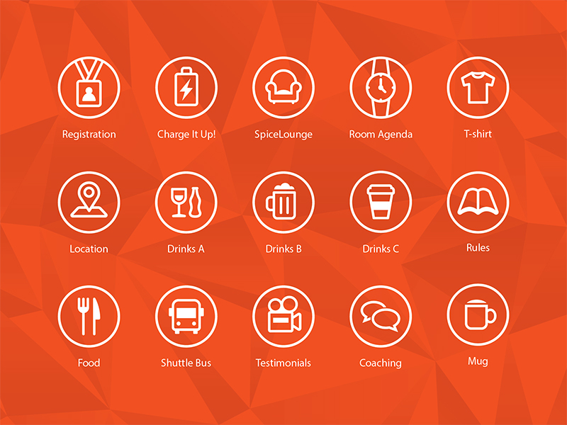
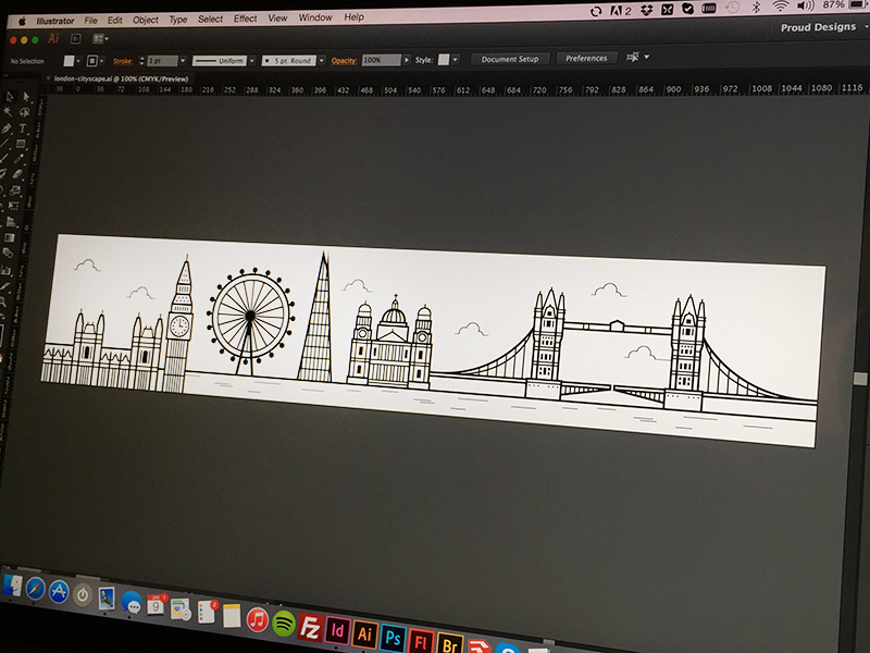
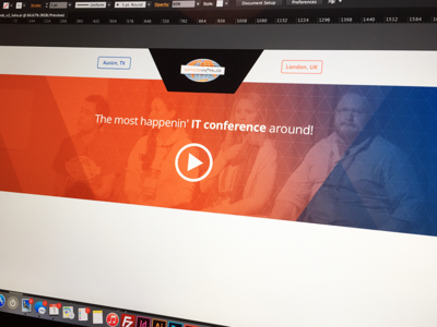
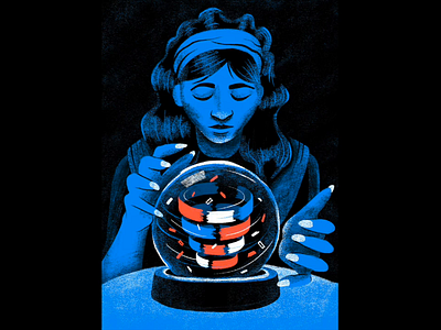
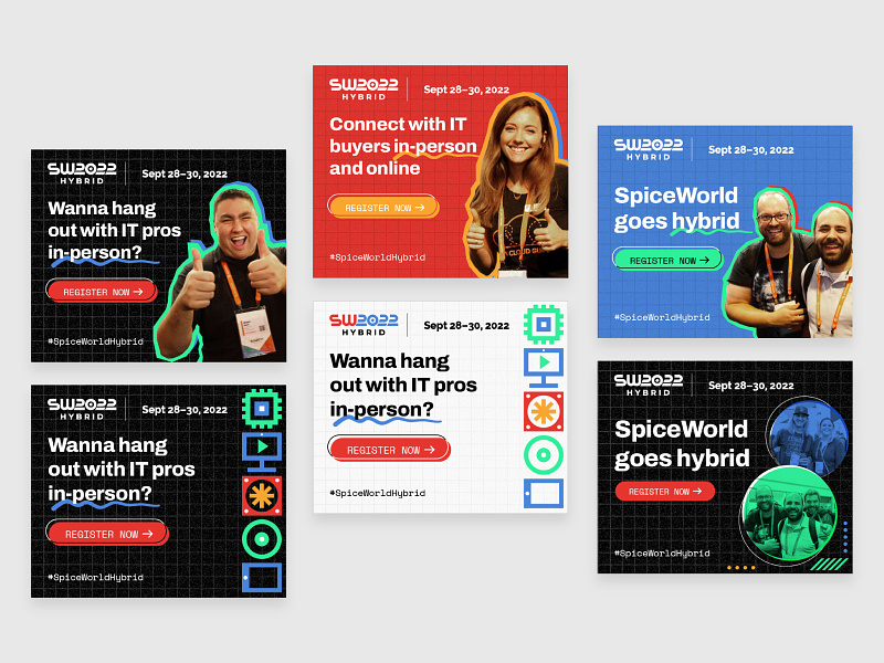
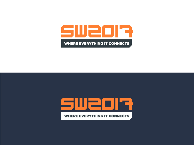
My favourite of all the unused SpiceWorld logo idea's I've had over the past month or so.
It incorporates the 'S' for SpiceWorld, the connection of people at these events, in both the infinity-like form of the mark, and the speech bubb...
One of the final wordmarks for SpiceWorld 2017 in Austin, TX. There are three versions in total, which will be used for different orientations and sizes. This was my favourite.
An early idea for the updated SpiceWorld mark, playing with the 'connected blocks' idea to symbolise the IT pro/vendor connections made at the annual IT event.
Although probably my favourite as a designer, we decided it may be a little ...
I recently refreshed the SpiceWorld logo (will upload later), and here's my artboard exploring a bunch of different directions.
The idea was to come up with more of a wordmark than a logo. A wordmark that could possibly change year-on-y...
Assisting @mattkohn in the brainstorming ideas for the design of the new SpiceWorld website, I came up with this. We ended up (kinda) throwing it out because of the slightly off-brand, purple hue created by the orange/blue gradient.
The...