2 Shots • 1 Attachment
October 09, 2013
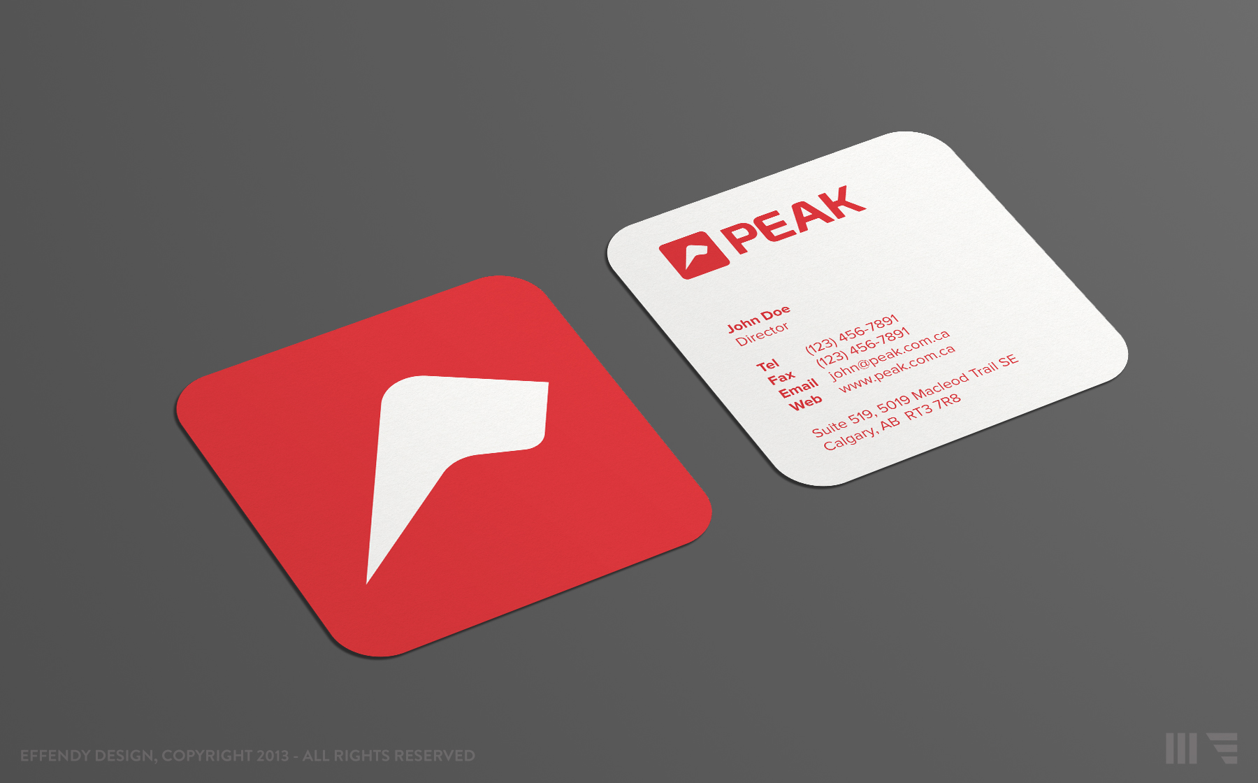
Business card designed for PEAK. P.S: Updated the K as per a Milosz & Kyle
February 22, 2013
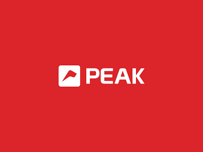
Every company desires to be at peak. That's the concept that the logo visualizes. The mark incorporates a mount made to look like a 'P'. More info to come.
Available for new projects