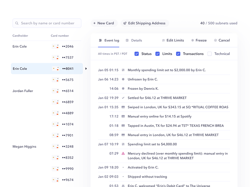
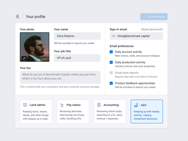
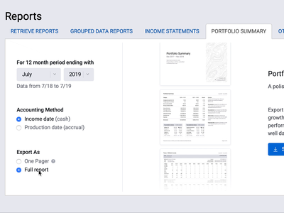
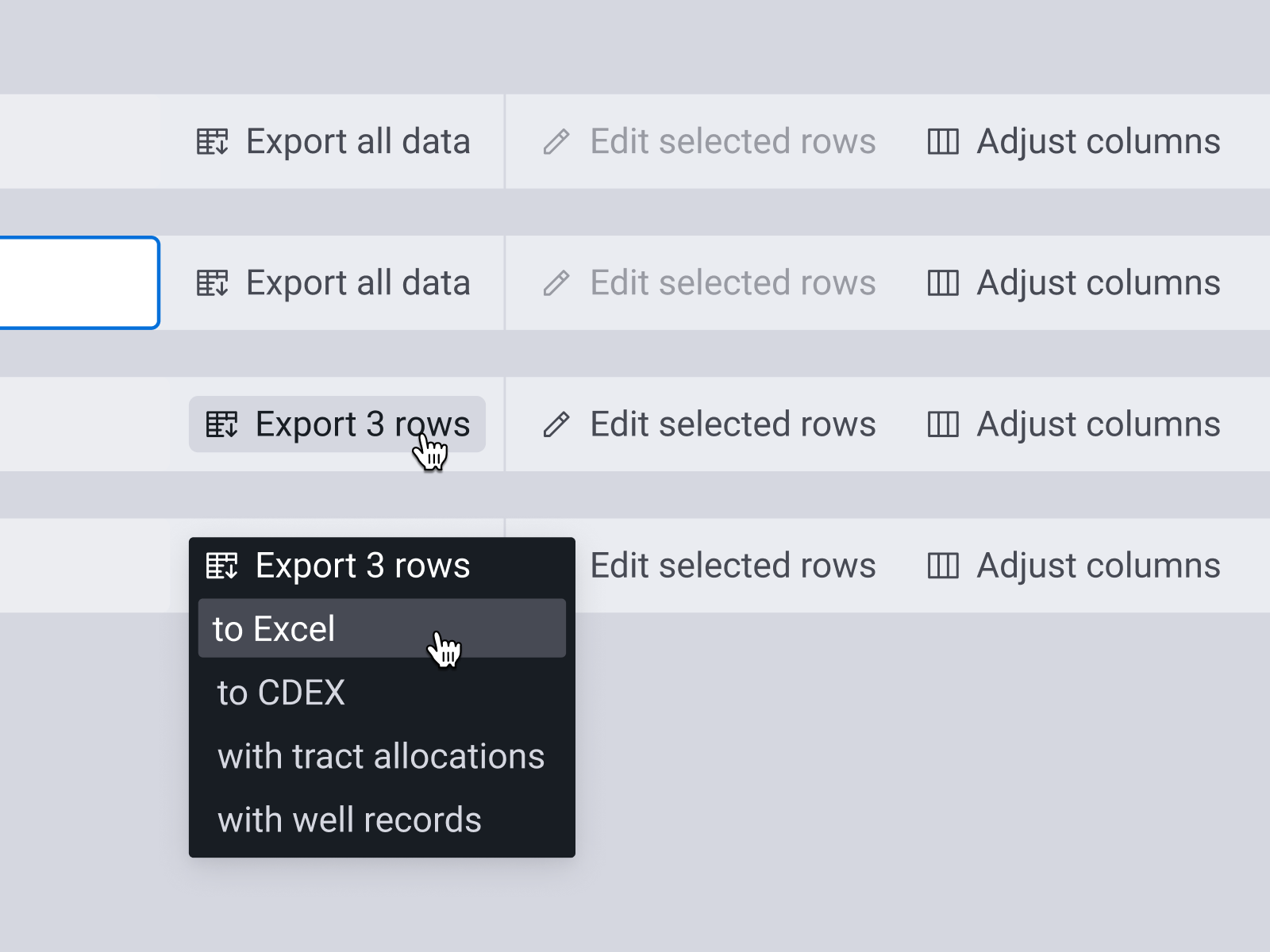
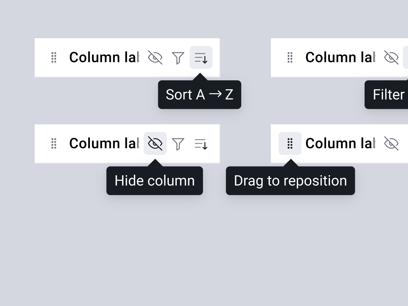
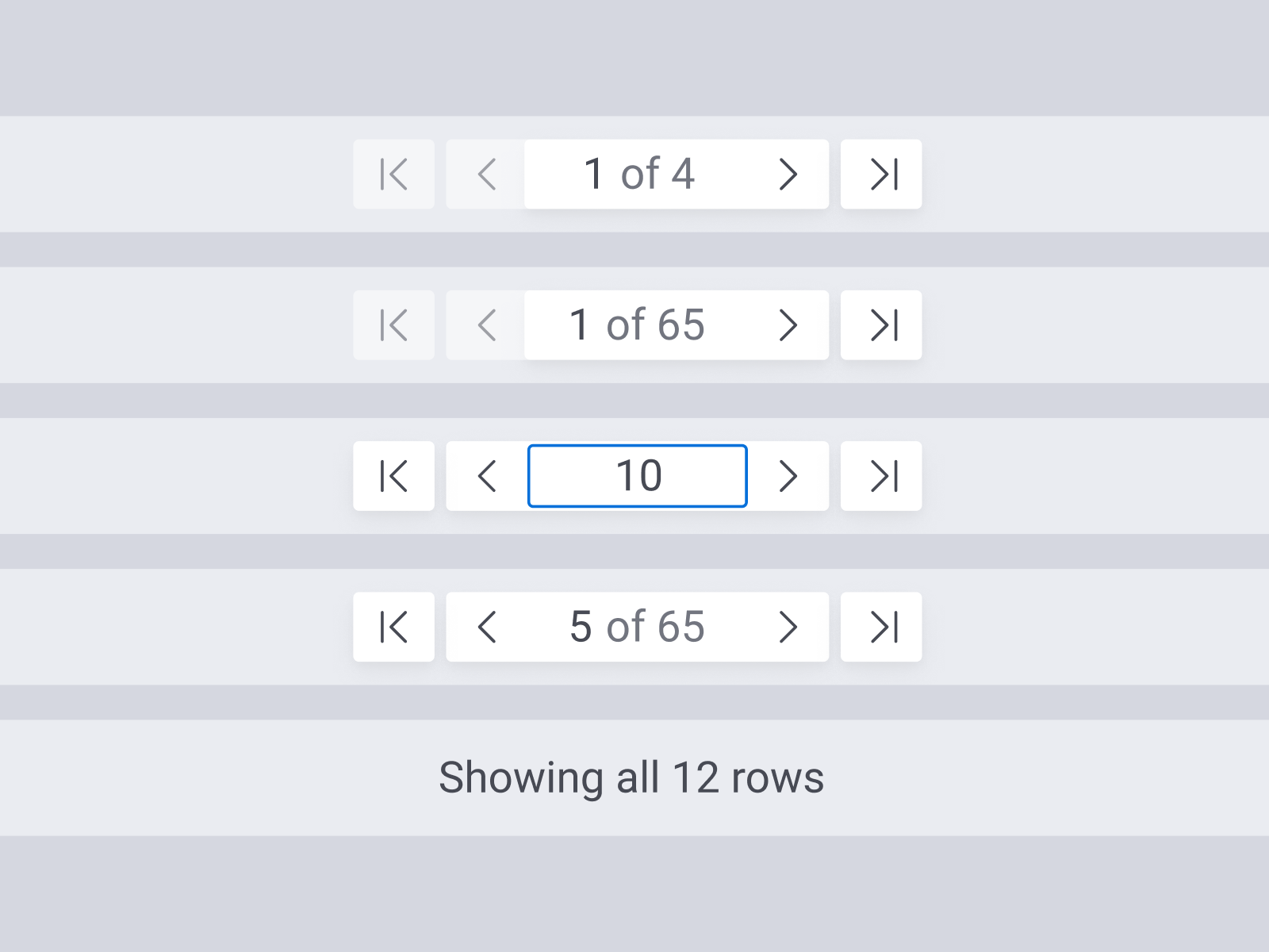
I've been experimenting themes of user onboarding and collaboration recently, and this is the most recent of that work.
We have some of this information in a settings screen now, but including information like a bio, job title, and role...
This was part of the portfolio summary report we launched a couple weeks ago that I wanted to highlight. We identified a use-case for a slimmed down portion of the report, aimed at more of a "quick overview" rather than the full (sometim...
This revision is the culmination of a ton of research and collaboration with internal teams and customers. We've been through a couple revisions of our navigation, but none have really hit the mark. The biggest challenge with MineralSoft...
This is a collection of components I designed for our data grids, everything from column headers, to pagination controls and export dropdowns. There was a lot of fun iconography I got to work on, and I think some of the table controls (s...
Another Storybook project of mine, this works similarly to my Icons shot, by providing developers with a visual method of variable identification, in addition to easy tools to grab the variable name.
At MineralSoft, we traditionally haven't had much of a need/opportunity to impact experience with user onboarding. We're enterprise, and as we've grown, that need has developed.
Recently, we've started launching improvements to our navi...
This was some code I wrote to support our Icon component in Storybook. It's a super easy way for developers to pop in and visually identify the icon they're looking for, then quickly grab read-to-use code for that icon. Coupled with Stor...
This is another iteration of our data tables, with a bunch of user experience improvements.
We found that there were flashes of "loading" data, which then resized the grid as data came in. This felt a lot like a traditional FoUC as css ...