2020 has definitely been the most memorable year so far. Many unprecedented things happened and I can't be more grateful that the work front stayed put for me unlike for many other people. As they say whatever doesn't kill you - makes yo...
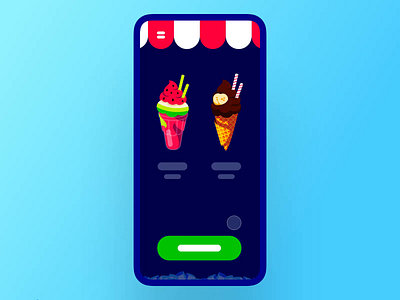
This shot is dedicated to all websites that advertise mobile applications. I wanted to make an interaction design for a promo page that allowed visitors to experience a product on their mobile screen. The closes existing analogy I saw wa...
This one is another one of my explorations for a card stack based UI. The icon in the bottom left indicates a layout you'll be navigated to if you tap on it, so if you are going back to the card stack you previously had selected - the ic...
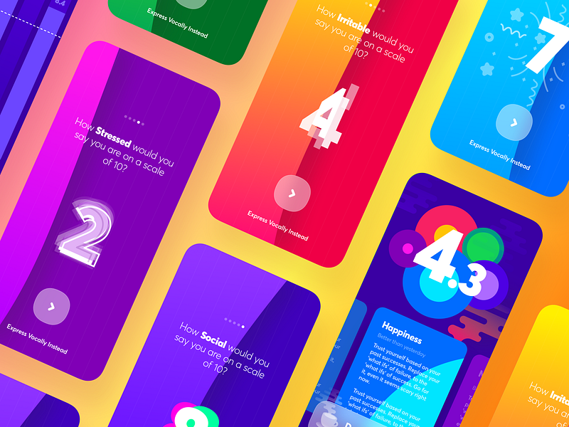
This one is a redesigned version of a quiz layout. Aside of the main actions a.k.a. yes & no users can swipe down to skip and check it later. Other, say personality tests, can be chosen from the top right drawer.
Don't forget to ch...
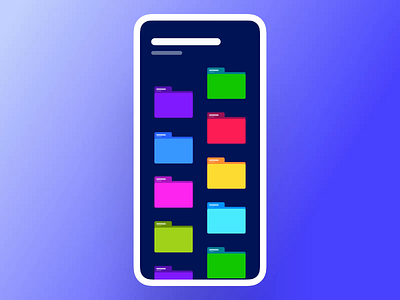
Here's a folder management UI I put together last weekend.
Sometimes I work with data loaded systems and those require pretty flexible filtering approach, especially when we're talking about mobile UI.
I thought this layout might be ...
Continuing on the email app shortcuts. As an email app user, I always appreciate quicker access to frequently used actions within the list of contacts, messages, e-mails etc.
What are the fast access actions would you like to have in y...
This navigation pattern represents sub-sections in the bottom nav bar. This approach proven to be pretty useful in a couple of my past projects so I decided to share.
Two of its main advantages are accessibility and convention. Amongst...