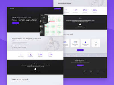
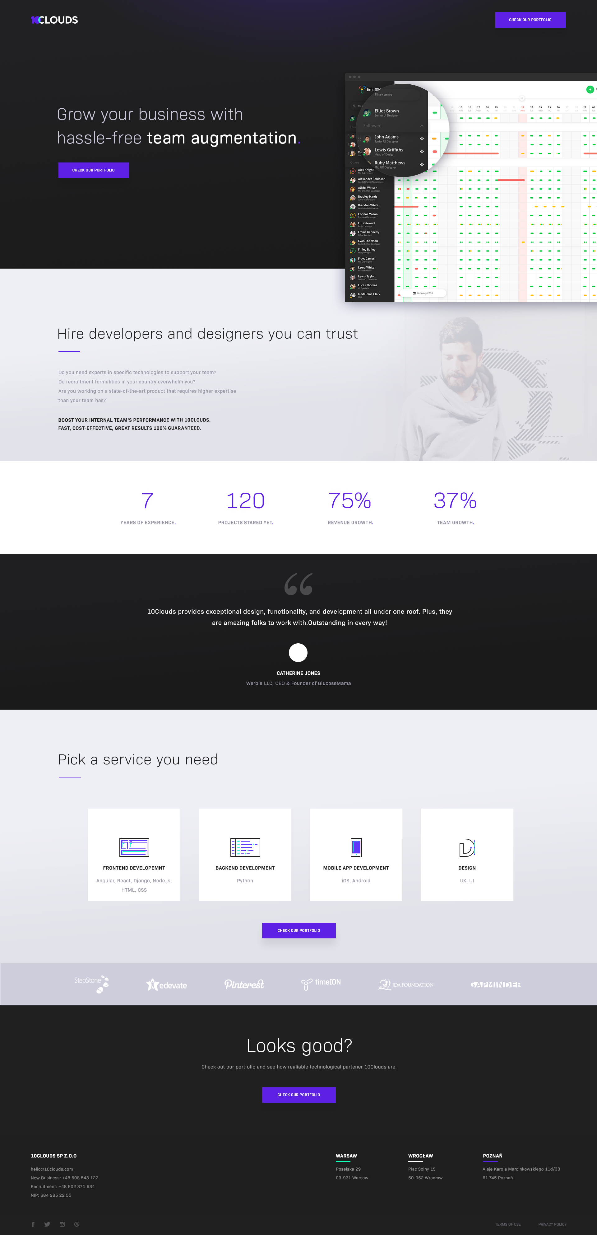
Recently we’ve been producing landing pages that play with the contrast of light grey and black, combined with our signature blurple shade. We go for simplicity. Minimal decorum and plenty of information. Looks good? Press L for Like
Two things are certain in our work: design and tech. Not necessarily in that order :)
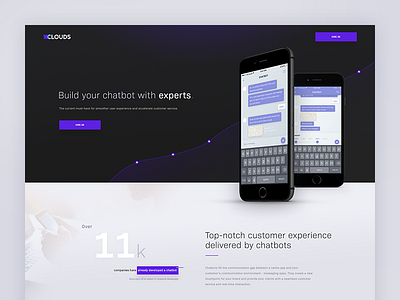
While we were designing the landing page for Chatbots, we were aiming at the perfect balance. The golden ratio. Pi.
We think we nailed it. If you a...
Hi dribbblers,
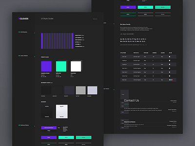
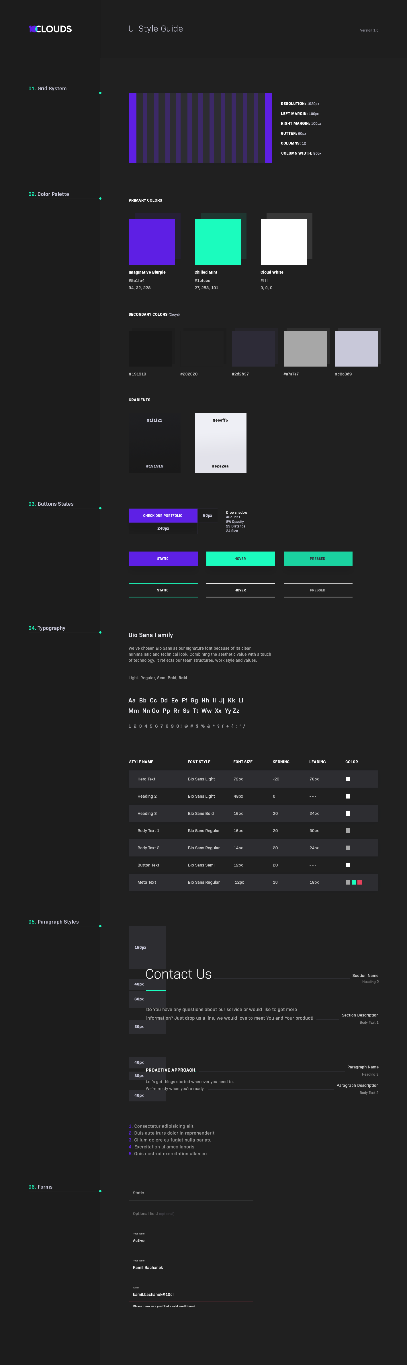
They say consistency is key so we decided to help our team stay on top of their game.
Here is a UI guideline for our developers. How do you like them designs?