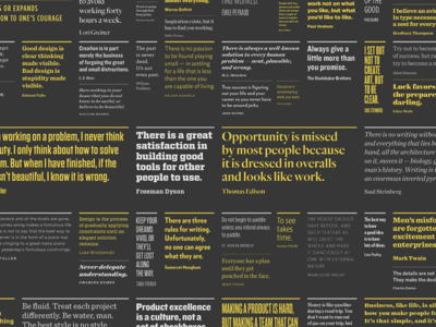
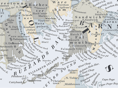
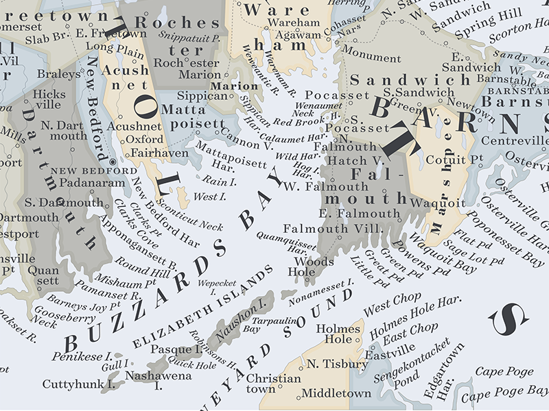
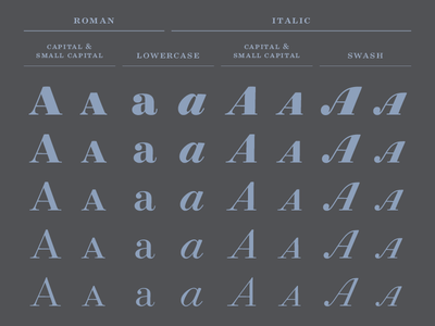
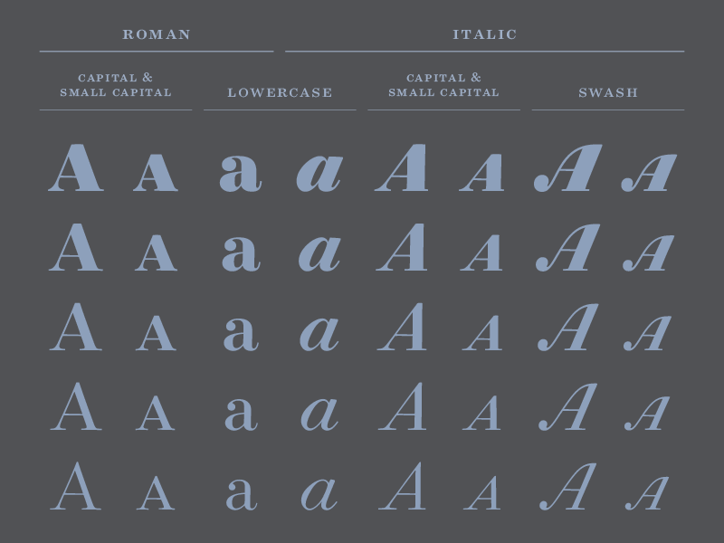
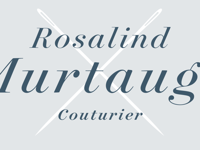
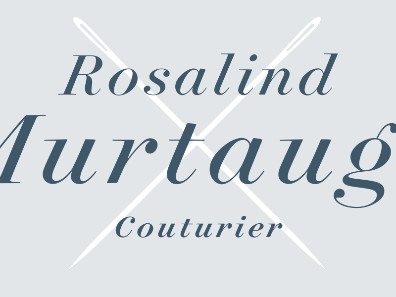
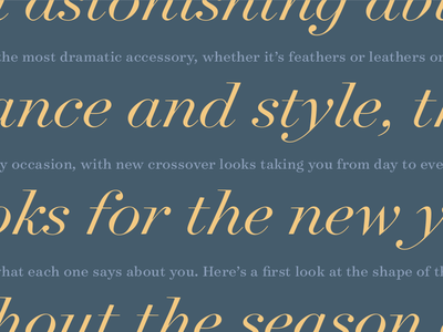
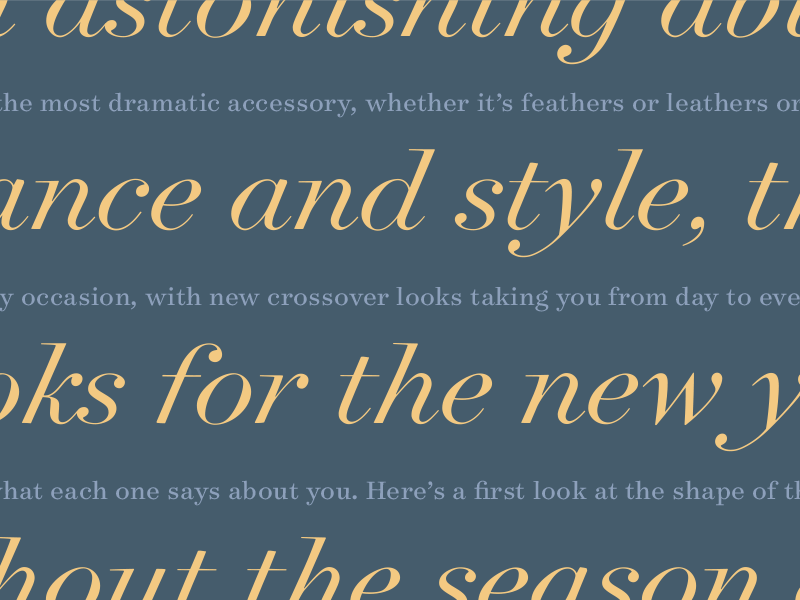
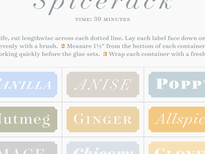
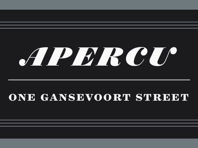
Buzzards Bay

March 26, 2014

This was the first piece of sample art I made using our Surveyor typeface, after it was completed. Since the fonts are based on engraved map lettering, I couldn't resist; I chose Buzzards Bay because it had a nice mix of coastal towns an...

The Surveyor Family

March 25, 2014

The Surveyor font family kind of resists being displayed in a grid, given its 140 styles. Here's the best that Brian Hennings and I came up with, showing just the Fine optical size (not the display, text, or ScreenSmart.)

Couturier

March 25, 2014

Some more of the Surveyor italics, showing a couple of telltale glyphs. The cap C — like the G and S — have ball terminals, instead of serifs; unusual for capitals, and something we've only explored once before in Archer. There's also an...

Surveyor Italic

March 25, 2014

We actually began Surveyor with the italic, not the roman. It's based on lettering used by mapmakers; the style is called (unglamorously) "stump style," and it's a form of lettering that endured on maps until they stopped being reproduce...

Spicerack

March 25, 2014

Some of the different moods we're coaxing out of the new Surveyor font. This image has all three of the optical sizes: the Fine in the headline, the Text below, and the Display in the colorful grid.

Apercu

March 25, 2014

Surveyor, a new font we're releasing. There are three optical sizes: "Apercu" is in the Fine Black Italic, with some alternate swashes that we can't resist.