Couturier
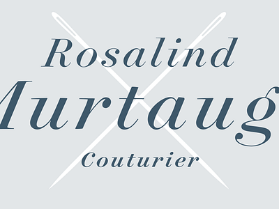
Some more of the Surveyor italics, showing a couple of telltale glyphs. The cap C — like the G and S — have ball terminals, instead of serifs; unusual for capitals, and something we've only explored once before in Archer. There's also an alternate 'g' in the middle line, one of a number of alternates that are lurking in the fonts. (More, here: http://www.typography.com/fonts/surveyor/features/surveyor-stylistic-sets)
View all tags
Posted on
Mar 25, 2014
More by Hoefler&Co. View profile
Like


