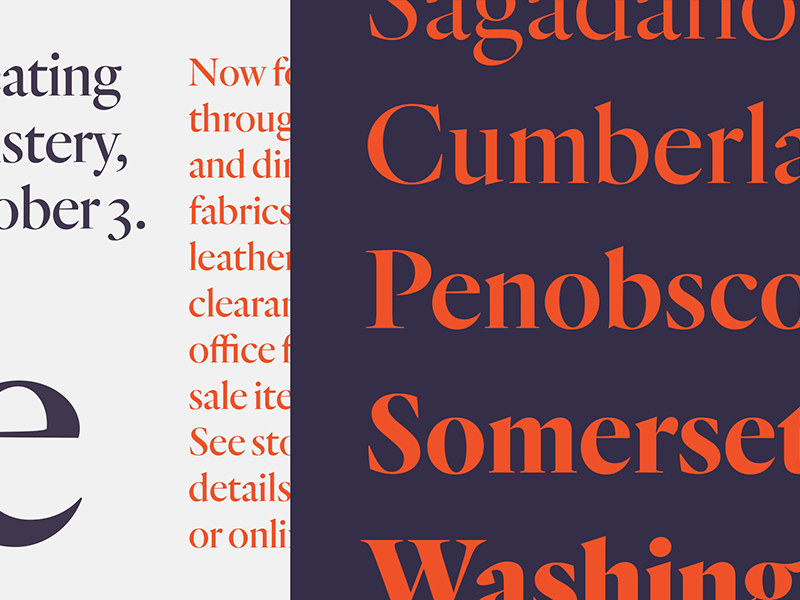
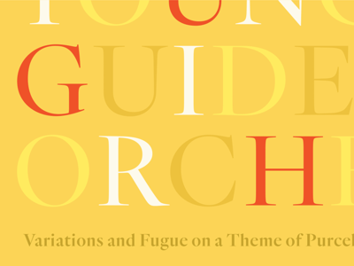
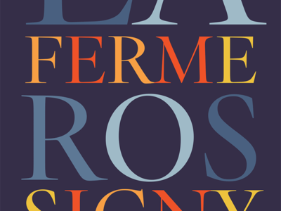
Some excerpts of our new Quarto typeface. One of my favorite parts of the project was deciding how to best replace some of the frumpier details of a 16th century original: these are some of the more fiery terminals and serifs drawn by de...
More of our new Quarto typeface. The weight range at the right is one of my favorite parts of the family: our Sara Soskolne drew the typeface, and this piece of art us by H&Co’s Brian Hennings. See more, here:
http://hflr.co/of9jv
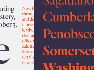
A little more of the new project. Quarto’s occasioned by a lovely sixteenth century roman typeface by Hendrik van den Keere, which we’ve interpreted in a range of weights, with italics. More, here:
http://hflr.co/of9jv