Quarto, large and small

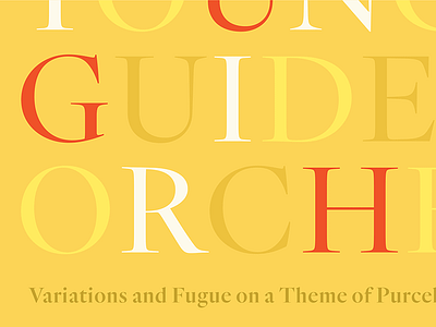
A little more of the new project. Quarto’s occasioned by a lovely sixteenth century roman typeface by Hendrik van den Keere, which we’ve interpreted in a range of weights, with italics. More, here:
A little more of the new project. Quarto’s occasioned by a lovely sixteenth century roman typeface by Hendrik van den Keere, which we’ve interpreted in a range of weights, with italics. More, here:


