🔍Advanced Search & Filters - Fund Comparison


Howdy all 👋🏼
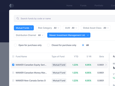
I’m pretty excited to share another close shot of the fund comparison product.
Main users of the platform are financial advisors, who are always in hurry and ideally want to see the most important information at first glance. Hence searching for funds and then comparing them, is one of the main functionalities. To make it as simple as possible for users, we display all possible filters and sorting functions directly on the front UI without hiding them under a drop-down. The slight challenge here is that enough space is required to display all filters and sorting options which sometimes makes the UI look cluttered.
❓ What do you think about filters and sorting options, do you feel that it's sometimes hard to display them?
Let's discuss below ⬇️🙌🏼
Are you looking to build a web or mobile application? We’re always looking to partner with great companies. Say hi at hello@fintory.com
Want to see more in the future?
Don't miss any of our shots and follow us on Dribbble.


