@Jim Leszczynski ... are you lion? HA!
@Andrew Colin Beck I believe you may be right.
I did try it with the lamb's face black, but it looked like a ink spot.
Maybe just a tad larger on the face. Thanks guys.
HA! that's funny @Andrew Colin Beck .
that's how this client got a hold of me. funny how things work out sometimes.
cheers. go have a beer now, its Friday!
it could be a bit too much symbolism in it to spot the lamb a bit quicker. Crown + sword are a bit too obvious i guess, it a bit outstands the lamb inside.
Ok, I finally saw it. This version is very intriguing & I love where it's going. I agree with Jord. Either a gap around the snout or around the back leg of the lamb/front leg of the lion. Awesome work as usual Mike!
@Jord Riekwel and @Jake Bartholomew thanks guys for the feedback.
Did you check out the attachment, by they way. I felt by taking the head and neck of the lamb above the back of the lion elped a bit. thoughts?
@Rudy Hurtado Global Branding appreciate the comment, Rudy. A ways to go on all these directions yet, but I'm feeling better on the options at this point due to some nice critiques on all three.
Cheers all.
Mike, I do think it helps moving the head & neck above the back leg of the lion. I'm still curious to see what it would look like to have a gap/line break somewhere between what is the lions knee/lambs back-side and the lions front foot. Something that flows with the two lines above the lamb. That's just me though. Either way loving your process & this mark.
The client is not going in this direction, but I felt I was getting closer to a final that might have worked nicely.
We are pursuing one of the other directions and I'll post when I can.
Thanks for looking.
24 Responses
one more style I'm exploring.
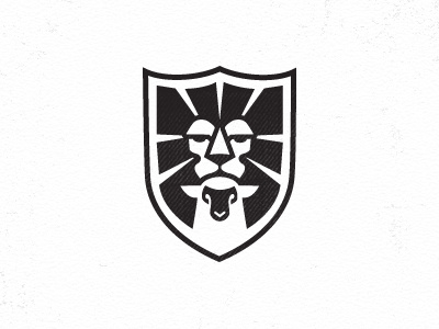
Just placed an attachment that I think helps the lamb play a better visual roll in the design.
Cekc it out: http://dribbble.com/shots/859134-Lion-Lamb-4/attachments/91414
6 months ago
This is great, however, it took me a while to find the lamb
6 months ago
@Roberto Torres Afraid of that. I know its not as obvious as the others, but sometimes its not bad. But maybe too obscure.
6 months ago
I still don't see it. Hah!
6 months ago
A little harder than desirable. Almost there.
6 months ago
@Jim Leszczynski ... are you lion? HA!
@Andrew Colin Beck I believe you may be right.
I did try it with the lamb's face black, but it looked like a ink spot.
Maybe just a tad larger on the face. Thanks guys.
6 months ago
Hahaha, so I recalled this other shot I had seen a while ago, that I was going to show you for reference, and it turned out to be yours!
http://dribbble.com/shots/471700-Lion-Lamb-Scroll-V2
6 months ago
ballin'
6 months ago
HA! that's funny @Andrew Colin Beck .
that's how this client got a hold of me. funny how things work out sometimes.
cheers. go have a beer now, its Friday!
6 months ago
... and ... it ... never ... stops ....
omg ... I'm tired ... have to go to bed right now ... ;D
6 months ago
@Mike Bruner hahaha cool.
Good luck.
6 months ago
Did the lion eat the lamb? I don't see it
6 months ago
the lamb is on the body! very nice, but i still preferred previous version! your options rocks!
6 months ago
it could be a bit too much symbolism in it to spot the lamb a bit quicker. Crown + sword are a bit too obvious i guess, it a bit outstands the lamb inside.
However - very nice job buddy :)
6 months ago
Nice good symbol for MASONRY and ILUMINISTS.
6 months ago
Whoa!
6 months ago
This is beautiful!
6 months ago
check out the new attachment and let me know if it helps. http://dribbble.com/shots/859134-Lion-Lamb-4/attachments/91414
THX
6 months ago
Nice one. Perhaps it would help to add a small gap of white near the snout? Just so it is not connected with the rest?
6 months ago
Ok, I finally saw it. This version is very intriguing & I love where it's going. I agree with Jord. Either a gap around the snout or around the back leg of the lamb/front leg of the lion. Awesome work as usual Mike!
6 months ago
Great logo Mike!
6 months ago
@Jord Riekwel and @Jake Bartholomew thanks guys for the feedback.
Did you check out the attachment, by they way. I felt by taking the head and neck of the lamb above the back of the lion elped a bit. thoughts?
@Rudy Hurtado Global Branding appreciate the comment, Rudy. A ways to go on all these directions yet, but I'm feeling better on the options at this point due to some nice critiques on all three.
Cheers all.
6 months ago
Mike, I do think it helps moving the head & neck above the back leg of the lion. I'm still curious to see what it would look like to have a gap/line break somewhere between what is the lions knee/lambs back-side and the lions front foot. Something that flows with the two lines above the lamb. That's just me though. Either way loving your process & this mark.
6 months ago
Rebound
Lion Lamb Dribbble
by Mike Bruner
The client is not going in this direction, but I felt I was getting closer to a final that might have worked nicely.
We are pursuing one of the other directions and I'll post when I can.
Thanks for looking.
5 months ago