


Hashtag #3


Here is another concept for Hashtag Management. With help from you guys : ) Do you think this is a better direction? I thought this time I would show on Dribbble first then later to the client...
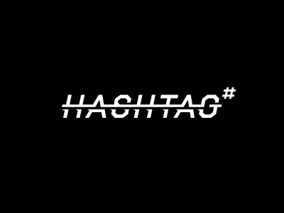
Here is another concept for Hashtag Management. With help from you guys : ) Do you think this is a better direction? I thought this time I would show on Dribbble first then later to the client...


