Find designers
Designer search
Quickly find your next designer
Post a job
The #1 job board for design talent
Inspiration
Courses
UX Diploma
Learn UX design from scratch in 6 months
UI Certificate
12-week UI skill building for designers
Live interactive workshops
with design professionals
Jobs
Go Pro
Log in
Dribbble: the community for graphic design
Advance your career with a Professional Diploma in UX Design
Learn more
Log in
Sign up
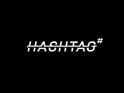
Hashtag #2
Rich Scott
Available for work
Follow
Following
Like
Get in touch
#000000
#F9F9F9
#ACACAC
#646464
Download color palette
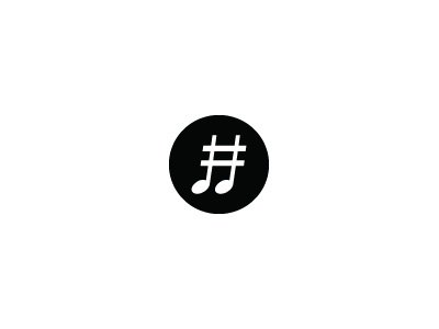
Totally different direction. A custom word-mark proposal. Again rejected : (
Rebound of
Hashtag Management
By
Rich Scott
artist
concept
hashtag
label
logo
management
monochrome
music
record
type
word mark
View all tags
Posted on Dec 6, 2012
3,111
4
50
15
View feedback
Rich Scott
Unique • Fresh • Timeless design solutions
Get in touch
More by Rich Scott
View profile
Previous
Next
Loading…
Loading…
Loading…