Find designers
Designer search
Quickly find your next designer
Post a job
The #1 job board for design talent
Inspiration
Courses
UX Diploma
Learn UX design from scratch in 6 months
UI Certificate
12-week UI skill building for designers
Live interactive workshops
with design professionals
Jobs
Go Pro
Log in
Dribbble: the community for graphic design
Log in
Sign up
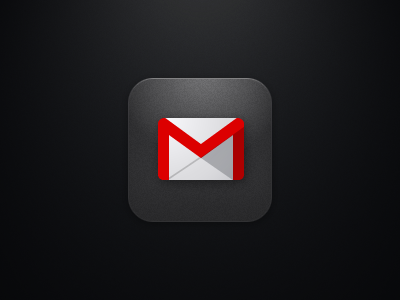
Gmail 2.0 App Icon
Chanpory Rith
Follow
Following
Like
#000000
#E4E4E4
#ACADB1
#DC0303
#AA0000
#727272
#DDA6A7
#B07F80
Download color palette
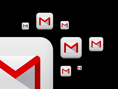
Here's the official icon I designed for Gmail 2.0 on iOS. Simpler, clearer, and more "Googley"
Rebound of
iOS Gmail Icon
By
Chanpory Rith
app
apple
google
icon
ios
ipad
iphone
retina
View all tags
Posted on Dec 10, 2012
3,193
3
103
14
View feedback
Chanpory Rith
More by Chanpory Rith
View profile
Previous
Next
Loading…