This is really solid! My only critique would be with the "estd 1972". It feels like an after thought in the layout, and I wonder if it would be better suited below the "Premium Quality Meats". That could however create clutter with the text you have below the main graphic. Food for thought.
can i ask how you got this job? Just seems strange that a company from a tiny little town in Australia, would get someone from Sweden to do it.
Excellent designs btw :)
@Joshua & @Danielle - Like I mentioned in the description, the idea is to have the banner as stand-alone for smaller applications and the stamp. But we'll probably be making a separate design for the stamp.
@Rowan - That's awesome. Ever heard of this company? The project was outsourced to me via the agency they hired for their re-branding, who found me via Dribbble.
No, I do not know the company. I've only been to the pub there which is very nice. The population of the town is only around 180 people, so a real little community, but the sort of place that attracts large amounts of tourists because the southern highlands is such a nice area.
@Emir Ayouni - its def. a good design, my only worry is when this is actually used when being smaller / shrunk down.. the farm bg and some of the type will be quite small .. unless they just want to make sure their name is seen?
23 Responses
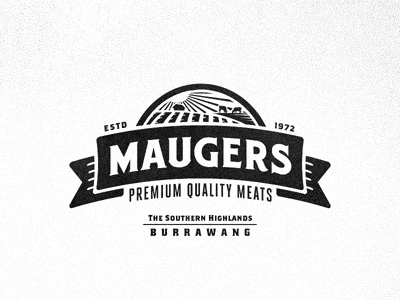
Further exploration for the re-branding of Maugers Meats.
Trying out a emblem design that can be split up into only using the banner for stamps on the paper bags.
Huge thanks to @Richie for helping out with some of his magic powers to tweak the display typeface.
7 months ago
That landscape is bad ass. Great work Emir!
7 months ago
Yeah! The landscape is awesome! I love how clean and simple it is!
7 months ago
Great type. Great banner. Great landscape. I'm loving how this is turning out.
7 months ago
This is really solid! My only critique would be with the "estd 1972". It feels like an after thought in the layout, and I wonder if it would be better suited below the "Premium Quality Meats". That could however create clutter with the text you have below the main graphic. Food for thought.
7 months ago
Love it! The rounded-edged banner works perfectly with the type.
7 months ago
Do you have a less detailed version for small applications?
7 months ago
very nice!
7 months ago
This took the best of both ideas and something new. I LOVE this, no hesitations!! Do you think you'll still get a clean stamp effect?
7 months ago
I live less than an hour from Burrawang.
7 months ago
Love it!!
7 months ago
oh goodness.... sooooo nice.
7 months ago
can i ask how you got this job? Just seems strange that a company from a tiny little town in Australia, would get someone from Sweden to do it.
Excellent designs btw :)
7 months ago
@Justin @Nick @Derrick @Steely @Mathias & @Aldrich - Cheers guys!
@Joshua & @Danielle - Like I mentioned in the description, the idea is to have the banner as stand-alone for smaller applications and the stamp. But we'll probably be making a separate design for the stamp.
@Rowan - That's awesome. Ever heard of this company? The project was outsourced to me via the agency they hired for their re-branding, who found me via Dribbble.
7 months ago
No, I do not know the company. I've only been to the pub there which is very nice. The population of the town is only around 180 people, so a real little community, but the sort of place that attracts large amounts of tourists because the southern highlands is such a nice area.
7 months ago
Oh, and I think that this logo will suit its setting/the town very well :)
7 months ago
@Rowan - Cheers, Rowan! I would love to visit the place someday.
7 months ago
Great stuff, mate.
7 months ago
Love the letterforms! Customized from Brothers?
One thing, the weight between some of the letters seems to be just a little off. The M feels thicker than the other letters, particularly the G.
7 months ago
Awesome! I feel like the scale of all the elements combined is really working here. Nice job!
7 months ago
@Emir Ayouni - its def. a good design, my only worry is when this is actually used when being smaller / shrunk down.. the farm bg and some of the type will be quite small .. unless they just want to make sure their name is seen?
7 months ago
Rebound
Maugers Meats - Logo/Emblem
by Emir Ayouni
Logo/Emblem for Maugers Meats.
Simplified after final revision round on the previous draft.
6 months ago
good work
6 months ago