I definitely like this one more. Although I agree with Robbie, it seems a bit crowded and I also wish the timestamp was easier to read as the contrast is a bit low. Have you thought about replacing "minutes" with "min." and "hours" with "hr" to make it less crowded?
12 Responses
Pro
Robin Raszka
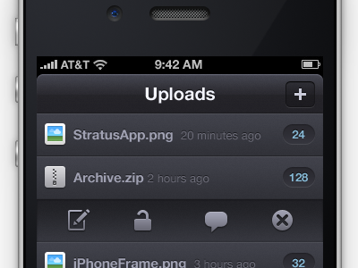
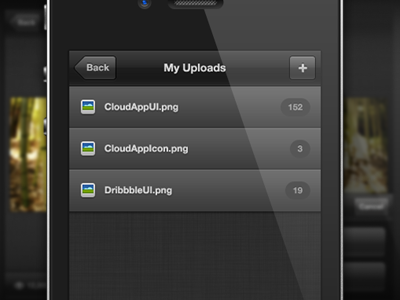
I don't like the font sizes—seems very small... so I fired up the Photoshop and start playing with the original idea and this is the result.
UPDATE: Grab the PSD here.
over 1 year ago
Pro
Robbie Pearce
The bigger font on the titlebar looks better, but I feel the rest looks far too crowded IMO :)
over 1 year ago
Pro
ludwiczakpawel
yea, it's pretty nice, but maybe if you made date font a lil bit smaller then it would look better, what do you think?
also i'm not sure about that rounded corners in title bar... i mean it's not so usual in iOS apps.
over 1 year ago
Pro
Martin Karasek
For me it looks better than original shot - got more information with better font sizing.
over 1 year ago
Pro
Jeff Broderick
Thanks Robin. I'll see what I can do. There are several things I like about this design.
over 1 year ago
I really like this redesign.
over 1 year ago
Would the menus be swipe to reveal like twitter, or would they slide out from the cells?
over 1 year ago
Damn. Looks really good!
over 1 year ago
Pro
Vilen
I definitely like this one more. Although I agree with Robbie, it seems a bit crowded and I also wish the timestamp was easier to read as the contrast is a bit low. Have you thought about replacing "minutes" with "min." and "hours" with "hr" to make it less crowded?
over 1 year ago
Huge improvement. A lot more character and color.
over 1 year ago
Pro
Robin Raszka
@Vilen you're right
Anyway, thanks guys for all these kind words! 8>
over 1 year ago
Pro
Robin Raszka
Grab the PSD from 365psd
over 1 year ago