I'm liking this a bit more than the original footer. Feels lighter and more inviting. And it's not competing visually with the black bar and spatter of the previous one.
Much better. Removing the splatter really lifted a lot of weight off the design. Feels more balanced. At least from the small previews you are sharing.
The background pattern and colors are awesome. I am a sucker for the greenish teal color mixed with black and white. And thanks for also choosing a different twitter bird. The blue on is starting to get old.
24 Responses
Pro
Tyler Thompson
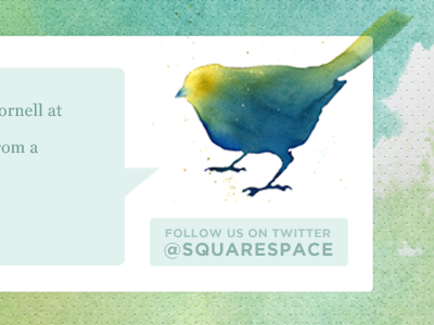
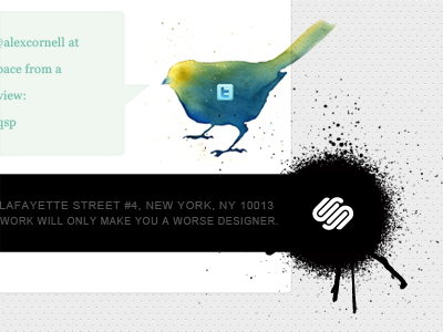
I tried to compartmentalize the elements to help them grid out a bit and line up. I think it works for now. Does that even make sense?
over 2 years ago
Pro
Christopher Meeks
Yep, makes total sense.
Looks great too!
over 2 years ago
Pro
Jake Przespo
I love it! Colors, alignment, everything looks awesome.
over 2 years ago
Pro
Erica Burnett
I like this approach. And the bird is great!
over 2 years ago
Looks much better.
over 2 years ago
I'm liking this a bit more than the original footer. Feels lighter and more inviting. And it's not competing visually with the black bar and spatter of the previous one.
over 2 years ago
Pro
Tyler Thompson
@Joshua - I actually moved this out of the footer into it's own block just for that reason.
over 2 years ago
Pro
Liam McKay
Perfect solution, stunning work.
over 2 years ago
This one looks much better.
over 2 years ago
Nice work here Tyler. Glad to see the little Twitter icon tossed out.
over 2 years ago
Pro
Gerren Lamson
awesome.
over 2 years ago
Defo looks better to me, looks clearer and glad you decided to ditch the t icon too.
over 2 years ago
Pro
Matthew Anderson
This looks amazing!
over 2 years ago
Pro
Andy McMillan
Bingo!
over 2 years ago
Pro
Kris Black
Much better. Removing the splatter really lifted a lot of weight off the design. Feels more balanced. At least from the small previews you are sharing.
over 2 years ago
Pro
Vance Reeser
That bird is great.
over 2 years ago
So when can we expect to see the new design live?
about 2 years ago
Pro
Ismael Burciaga
The background pattern and colors are awesome. I am a sucker for the greenish teal color mixed with black and white. And thanks for also choosing a different twitter bird. The blue on is starting to get old.
about 2 years ago
love how the bird's tail breaks out of the grid and gives some asymmetry. when is this going live? ;)
almost 2 years ago
I agree with Ismael, Twitter birds are getting played out, this is a great representation.
almost 2 years ago
Pro
Phil Moody
Tis’ beautiful
over 1 year ago
Has this gone live yet?
over 1 year ago
Pro
Renee Swigert
Is this live yet? I would love to see it!
over 1 year ago
Pro
Phil Lester
Gorgeous.
10 months ago