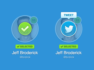
Thanks guys for your feedback! I have taken almost all of it into consideration.
This is how I see it working...Shows a list of fullsize avatars, user clicks an avatar, is fades out, and checkmark fades in. After a short delay checkmark fades out and tweet button fades in. Tooltip only shows for the most recently selected avatar.
For me, there isn't enough of a difference in opacity between the photo and the overlay, so it looks pretty busy. I also question the need for a tooltip over the Twitter icon. Really pretty subtle details though :)
I really like it! Specially colors and the bedges, but it has necessarily yo be on the faces? I'm just asking, maybe it has something related to the app itself, but maybe it could be at the bottom, like half in, half out of the avatar. Then the faces would still be visible. Just being picky :)
I really like it. The only thing I'm not too keen on is the second avi, where there's the Twitter overlay, a tooltip and the '53' in the background, because it just looks a tiny bit cramped.
The 'selected' label would make happy to the UX guy, but to me seems something that you can remove it and try it in a different way. And I have a friend who would say... 'don't cover the fucking faces'. But to me it's fine.
Prefer this version a lot more Jeff, good job. Out of interest... do you work for someone or work for yourself? you always seem to be working on cool projects!
I love the way it looks! nicely balanced colors, nice fine tuning. Really like it! maybe the only thing that may (or may not) feel a bit weird is to have the icon over the faces, I am not sure how important is for your users to visually recongnise the person they are looking at if they can't remember names well ; )
Doesn't this dramatically reduce the scanability of those you've selected if you're looking back through to review?
For example, there's a grid of 20 faces. I select 9 of them, I want to double check who I've marked. Unfortunately now I have to read the names beneath each check mark as you've fully obscured the photographic reference point.
Unless the use case is for something "hot or not" style (only 2 or so faces on screen at once) this feels over-designed to me.
20 Responses
Pro
Jeff Broderick
Thanks guys for your feedback! I have taken almost all of it into consideration.
This is how I see it working...Shows a list of fullsize avatars, user clicks an avatar, is fades out, and checkmark fades in. After a short delay checkmark fades out and tweet button fades in. Tooltip only shows for the most recently selected avatar.
Check out the attachment for the full view.
11 months ago
Pro
Atanas Mahony
you got something on your face (sorry i couldn't resist !)
I love it ! :)
11 months ago
Pro
Joey Lomanto
Dude this is stupid how nice it is. I love it. Can't wait to see this come together. Big fan, Jeff.
11 months ago
Pro
Mandy McClausky
For me, there isn't enough of a difference in opacity between the photo and the overlay, so it looks pretty busy. I also question the need for a tooltip over the Twitter icon. Really pretty subtle details though :)
11 months ago
Pro
Cesar Zeppini
I really like it! Specially colors and the bedges, but it has necessarily yo be on the faces? I'm just asking, maybe it has something related to the app itself, but maybe it could be at the bottom, like half in, half out of the avatar. Then the faces would still be visible. Just being picky :)
11 months ago
Pro
Zander Brade
I really like it. The only thing I'm not too keen on is the second avi, where there's the Twitter overlay, a tooltip and the '53' in the background, because it just looks a tiny bit cramped.
Apart from that, it rocks.
11 months ago
The 'selected' label would make happy to the UX guy, but to me seems something that you can remove it and try it in a different way. And I have a friend who would say... 'don't cover the fucking faces'. But to me it's fine.
11 months ago
Pro
Maxwell Barvian
Very nice improvements. Looks really fun to use :)
11 months ago
Pro
Daryl Ginn
You guys are nuts. This is awesome, what are you talking about?
11 months ago
Pro
Rich Smith
Prefer this version a lot more Jeff, good job. Out of interest... do you work for someone or work for yourself? you always seem to be working on cool projects!
11 months ago
Ugh. You've got something frilly on your face. ;)
11 months ago
Pro
Derek Briggs
Needs more linen ;)
11 months ago
Pro
Jeff Broderick
@Derek I'm going to have to kill you.
11 months ago
Pro
Aleksandar Djuric
This is perfect! Well done!
11 months ago
I love the way it looks! nicely balanced colors, nice fine tuning. Really like it! maybe the only thing that may (or may not) feel a bit weird is to have the icon over the faces, I am not sure how important is for your users to visually recongnise the person they are looking at if they can't remember names well ; )
11 months ago
Pro
Dhiren Adesara
Damn Good !
11 months ago
Pro
krishnachaitanya
really nice!
11 months ago
Are the selected label and the big checkmark representing the same? if so I don't see the point on the big checkmark.
11 months ago
Pro
Kyle Meyer
Doesn't this dramatically reduce the scanability of those you've selected if you're looking back through to review?
For example, there's a grid of 20 faces. I select 9 of them, I want to double check who I've marked. Unfortunately now I have to read the names beneath each check mark as you've fully obscured the photographic reference point.
Unless the use case is for something "hot or not" style (only 2 or so faces on screen at once) this feels over-designed to me.
11 months ago
Rebound
Selected Avatars
by suskey
; )
11 months ago