Notefile for Mac take 3

After living with the previous design for a while I've finally decided to rework it one more time. There were two main issues with the previous design:
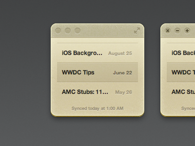
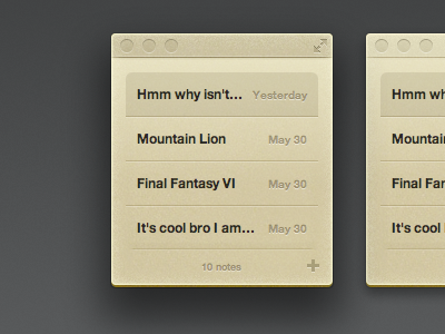
It didn't feel quite at home. It felt like some weird mashup of a widget and an app. Which is sort of what I was going for, but the balance was off—it needs to feel more like an app. I think these latest tweaks help significantly. The corner radius is now standard, the title bar is the normal height, and the buttons match up perfectly with their standard positions.
It was buggy. First a visual quirk popped up in Mountain Lion. Then it got fixed… and then a week later it showed up in 10.7.4. Now that I'm using the standard corner radius I won't have to worry about it anymore. I've also had cases where the window just didn't have a shadow when it first launched, which should no longer be a problem now that it's an opaque window with a standard shadow.
So! Here we are. I miss the roundier corners, but overall I think it's a great change.